Evorrah's Blog · Weddings · Essay
Quiet Luxury Is Changing: What Comes After Beige Weddings?
The beige wedding was never about beige — it was about fear of getting it wrong. What replaces it keeps the discipline and returns the conviction.
The beige wedding was never about beige — it was about fear of getting it wrong. What replaces it keeps the discipline and returns the conviction.
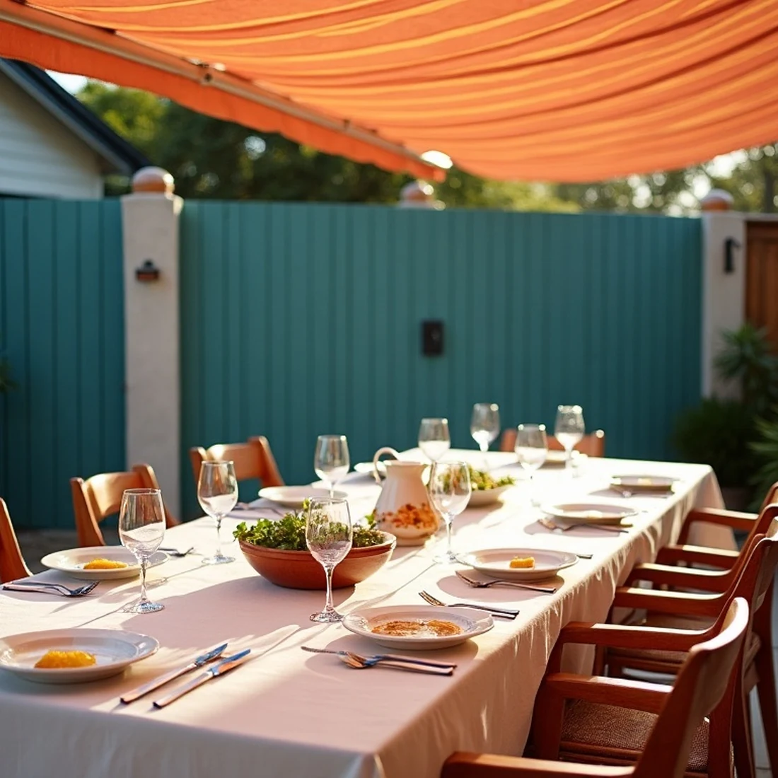
For roughly four years, the most photographed weddings in the world have shared a palette you could mix from oat milk: cream, bone, sand, mushroom, the occasional daring pampas beige. The look was called quiet luxury, and its obituary is now being drafted by the same publications that canonized it. Before joining the funeral, it is worth asking what the beige wedding actually was — because the answer explains precisely what will replace it, and it is not, as the pendulum-pushers hope, maximalism.
The beige wedding was not a color preference. It was a risk posture. A neutral palette cannot clash, cannot date badly in photographs, cannot be judged wrong by any guest's taste — and in an era when every event is published, the fear of a visible mistake outweighed the hope of a visible triumph. Beige was the aesthetic of not being wrong. Add the era's economic mood and the algorithmic flattening — the same fifty images taught to everyone planning in the same year — and you get a global sameness that was never one couple's fault. Each individual beige wedding was a reasonable decision. All of them together became a genre, and genres exhaust.
Here is what the backlash will get wrong: quiet luxury's discipline was correct. The editing was correct. The insistence on materials over decorations — real linen, real cotton paper, real candlelight — was correct. The coherence, one world across every touchpoint, was the most correct thing about it and is the permanent lesson. The failure was narrower than the critics say: quiet luxury confused restraint of quantity (right) with restraint of conviction (wrong). It edited down the number of decisions and then also edited out the point of view, leaving beautifully produced events that said nothing in particular, exquisitely.
The trend industry's reflex is to announce the opposite: more color! more pattern! the return of excess! We don't buy it, and neither do our clients' approvals. Households that spent four years learning to love restraint do not wake up wanting a carnival; they wake up wanting restraint with something to say. What is actually landing in 2027 briefings is a precise hybrid we'd call pigmented conviction: the quiet field stays — the linen, the cream, the calm — and onto it returns one real color, held with the same discipline beige applied to everything. A Campari red used exactly three times. A bottle green that owns the evening's dark voice. An inked blue carrying the typography. The 2027 Color Report is six variations on exactly this structure, and it is no accident that every one of them is "a quiet field plus a conviction."
The second successor is not a color at all. The most interesting events we're designing now source their identity from something specific and owned — the villa's actual awnings, the family's actual heritage, the boat club ledger, the grandmother's china — rather than from a palette genre at all. Specificity is beige-proof: nobody else's wedding can look like yours if yours is built from your own material. This is why the Event DNA method starts with place and story rather than with swatches, and why the question we ask clients has shifted from "what colors do you love?" to "what do you have that no one else has?"
Since this essay inaugurates the question we'll keep asking of trends: beige, as a field — permanently in. Beige, as the whole story — over, and not coming back in this cycle, because its driver (fear of visible error) is being outcompeted by a stronger force: fear of being indistinguishable. When those two fears trade places, palettes get braver. That trade is what 2027 looks like.
The house's whole method is the one this essay argues for — few decisions, held everywhere. See it in a real commission.
Commission a suite How it works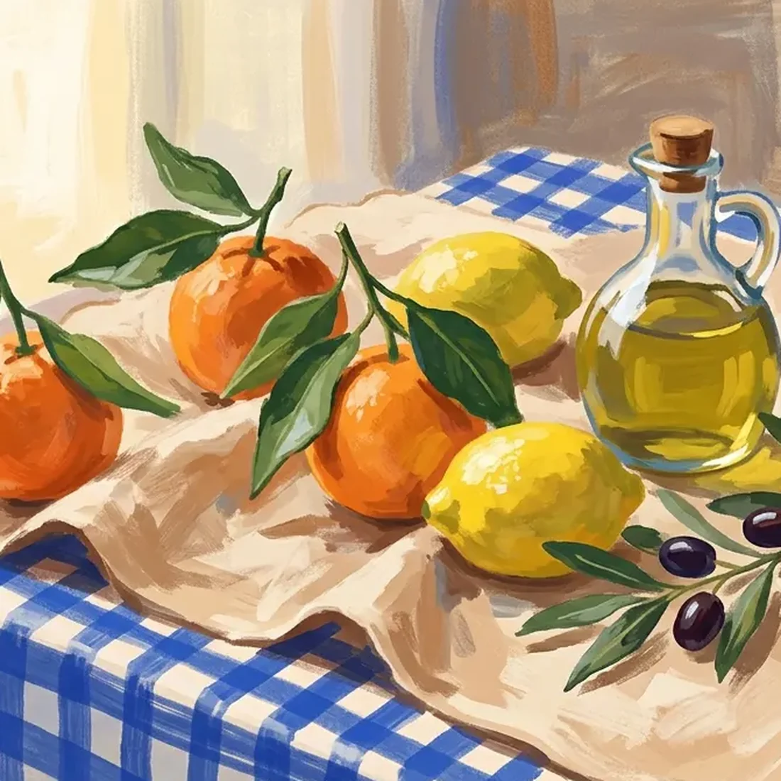
Six palettes we believe in for 2027 — sources, roles, and what each replaces.
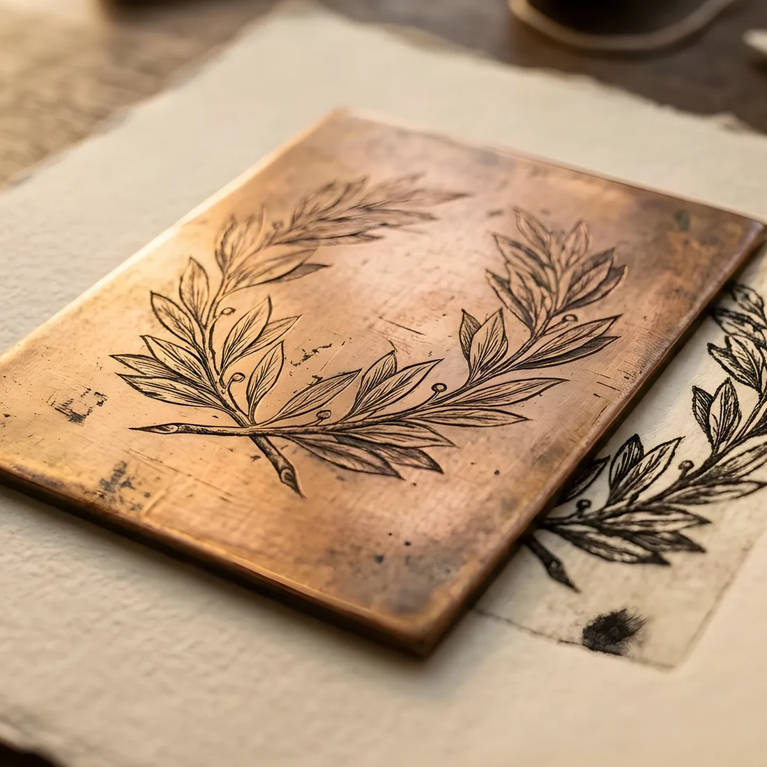
Eight things changing next year, each tied to something we actually printed.
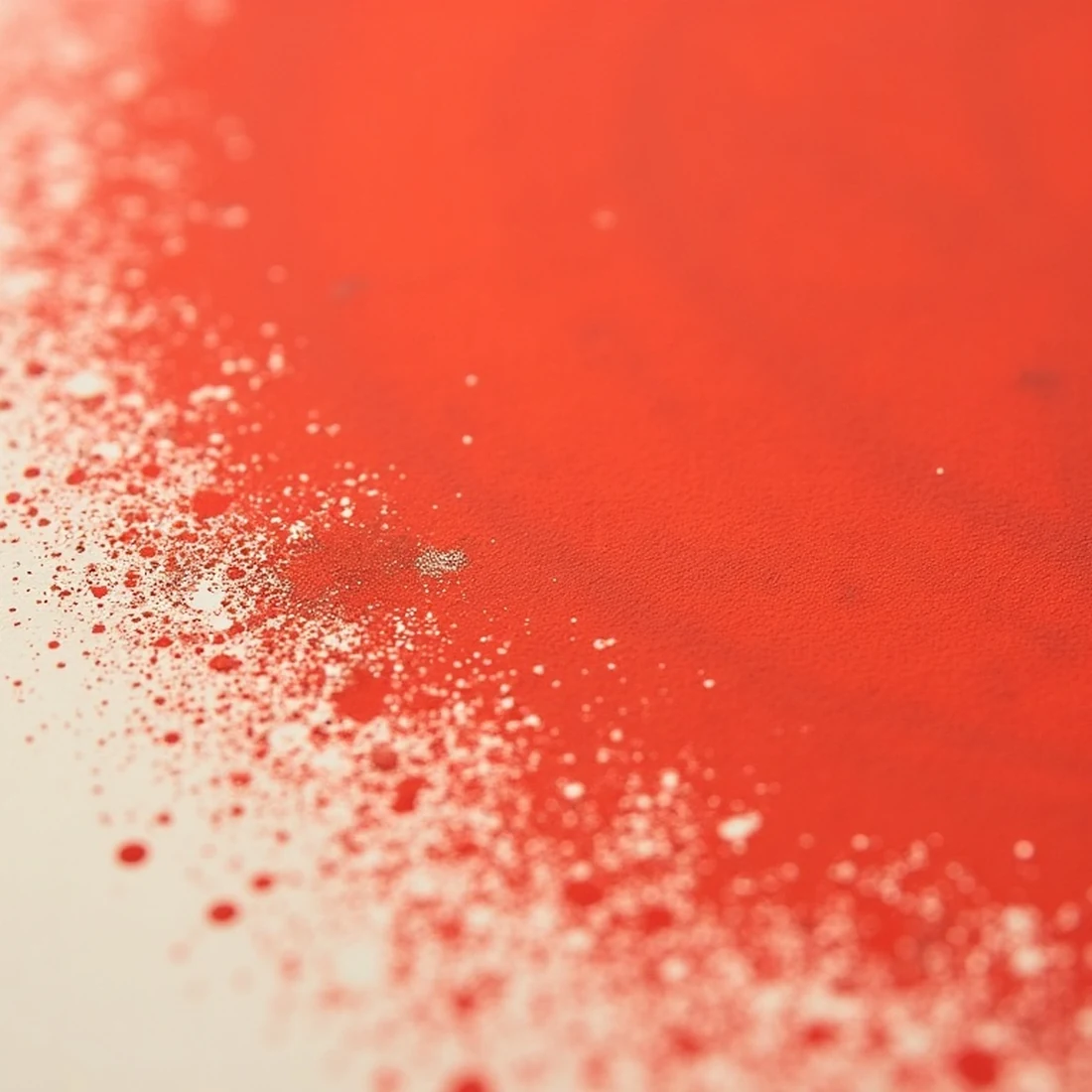
Twelve named directions — each with its logic, palette, and the mistake that ruins it.