Evorrah's Blog · Weddings · Trend Report
Wedding Invitation Trends 2027
Eight things changing in wedding stationery next year — each one tied to something we actually set, printed or watched a guest do.
Eight things changing in wedding stationery next year — each one tied to something we actually set, printed or watched a guest do.
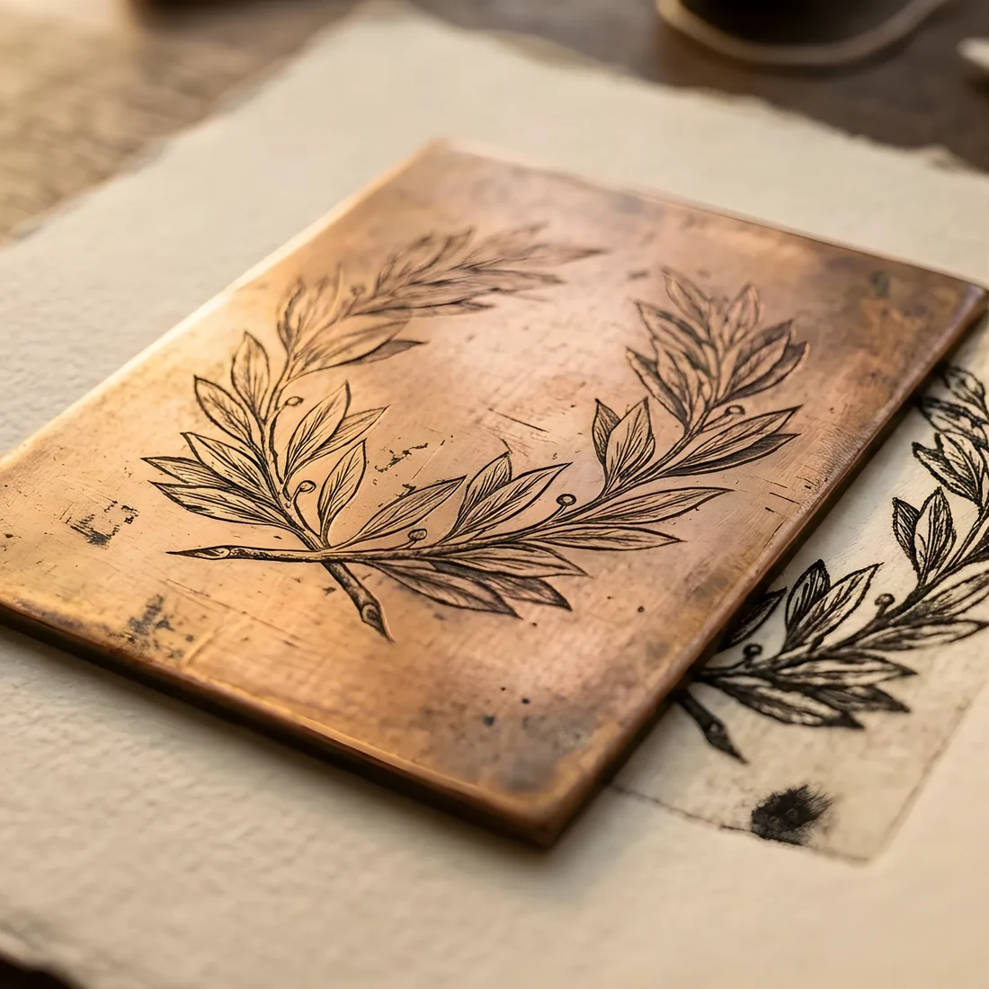
Trend pieces in this industry are usually written by looking at other trend pieces. This one is written from a production queue: the suites the house set this year, the stock we ordered twice because the first run sold out, the questions clients asked so often they stopped being questions and became defaults. Eight things are genuinely changing for 2027. Three things are ending. Where a claim comes from something we printed, it says so.
For a decade the invitation carried everything: ceremony, reception, dress code, website, and a reply instruction squeezed along the bottom. That page is now the quietest in the suite. What changed is that the enclosure — the small card behind the invitation — stopped being an afterthought and became the operational sheet: the link, the code, the travel note, the timing.
This is a good division of labour. The invitation makes a promise; the enclosure keeps the logistics off it. In practice it means the invitation can be set at a size and stock that would be wasteful if it also had to hold six lines of small print, and the enclosure can be digitally printed at a fraction of the cost. We now set more enclosures per suite than at any point since the house opened — three is common where one used to be.
The single largest change is not visual at all. It is that a suite is no longer one artwork; it is one artwork issued hundreds of times, each copy carrying its own household's name, greeting, language and table.
Guests do not read this as a technical feature. They read it as being expected. The detail that lands hardest is the smallest: a guest's name set in the same type as the couple's, at the right size, with the right accents — Nikhil and Éléonore spelled correctly, in a typeface that has the glyphs for both. The full mechanism, and its honest limits, is in the per-guest guide.
The stock-palette era is closing. For three years the same six palettes circulated — sage and cream, terracotta and rust, black and white, dusty blue. What clients ask for now starts from an object: the awning outside the hotel, a grandmother's tile, the particular green of the olive trees on the drive up.
That is a harder brief and a better one, because the resulting palette belongs to one event and cannot be recognised from anyone else's. It also changes production: a colour pulled from a photograph rarely survives contact with a press without being re-specified, which is why every palette we ship carries print values as well as screen ones. If you are choosing between methods, the printing comparison covers what each does to a mixed colour.
Heavier cotton stock has been the luxury signal for years. The 2027 move is textural rather than thicker: mould-made papers with a genuine deckle — the soft, slightly irregular torn edge that comes off the mould rather than a die.
Two practical notes, because this is where enthusiasm meets the mailing table. A true deckle edge is not consistent, and that is the point; if you want four identical edges, you want a die-cut and should say so. And a deckled invitation needs an envelope with room to spare, which is a size decision made at the beginning, not at the end.
The QR code stopped being embarrassing the moment it stopped being an add-on. Drawn at the suite's scale, in the suite's ink, on the enclosure rather than the invitation, it now does more work than the reply card ever did — and unlike the reply card it can be corrected after printing, because the destination is yours to change.
The rule we apply without exception: a QR code never touches the invitation itself. The invitation is the object someone keeps. The enclosure is the object someone uses.
Sending everything at once is over. The pattern that has become normal is a save the date that is genuinely minimal — names, date, place, nothing else — followed months later by a suite that can afford to be beautiful because it is not also breaking news. The calendar for both is in the timing guide.
Growth in 2026 was not in the invitation. It was in everything after it: menus, place cards, table numbers, orders of service, bar cards, thank-yous. A guest spends perhaps twenty seconds with an invitation and three hours with a menu at forty centimetres. Couples have worked this out. The checklist lists every piece a wedding can carry, with when to order each.
The all-caps sans invitation — wide letterspacing, thin weight, everything centred — has run its course. What is replacing it is not a return to script but a return to typographic manners: a serif with a real italic, one size relationship doing the hierarchy instead of four, and generous space around the names because space is the thing that reads as expensive.
Take one. A suite that adopts eight trends is a mood board, not an identity — the argument for choosing a small set of decisions and repeating them is here. The couples whose stationery still looks right in ten years picked one idea with conviction and let everything else be quiet.
The strongest are per-guest personalization (one design, issued as a different file per household), the return of the enclosure card as a real object, painted and hand-mixed colour over stock palettes, mould-made and deckle-edged stock, and QR codes that finally sit inside the design rather than beside it. Ending: the acrylic slab, the all-caps sans invitation, and the standalone welcome sign.
Yes, and more so — but as one element rather than the whole suite. The pattern we set most often now is a letterpressed invitation with digitally printed enclosures, which puts the money where the guest's hands go first and keeps a nine-piece suite affordable.
A QR code printed as an afterthought is. One drawn at the suite's own scale, on the enclosure rather than the invitation, in the suite's ink, is now the most-used piece of a modern suite. The rule is that it never touches the invitation itself.
Every trend here is a decision someone made for one event. Yours starts with two moodboards in 48 hours — then a suite built only for you.
Wedding invitations at Evorrah See the finished work
What each method does to paper, light and budget.
Wording, timing, printing, budget — the definitive reference.
Three hundred invitations for three hundred people — what per-guest design changes.