Creative Direction · 2026
Two Worlds · A The Salvage Slab · B The Painted Mark
CS
Brand & Business · Leith, Edinburgh
The Cold StoreTwo Worlds
The substance, or the signage
The substance, or the signage
The brief
The building was made in 1911 to keep things frozen; Ingrid is going to cook everything in it over live fire. Both worlds take that contradiction literally — one from the building’s substance, one from its signage. Neither softens it.
The hidden heart
“She is not opening a restaurant in an old building. She is putting her grandmother’s workplace back into use, on its own terms.”
Solveig packed herring here in the 1950s, at fifteen; she said the cork walls sweated in summer. The severity is the respect.
Grounding — from the research dossier
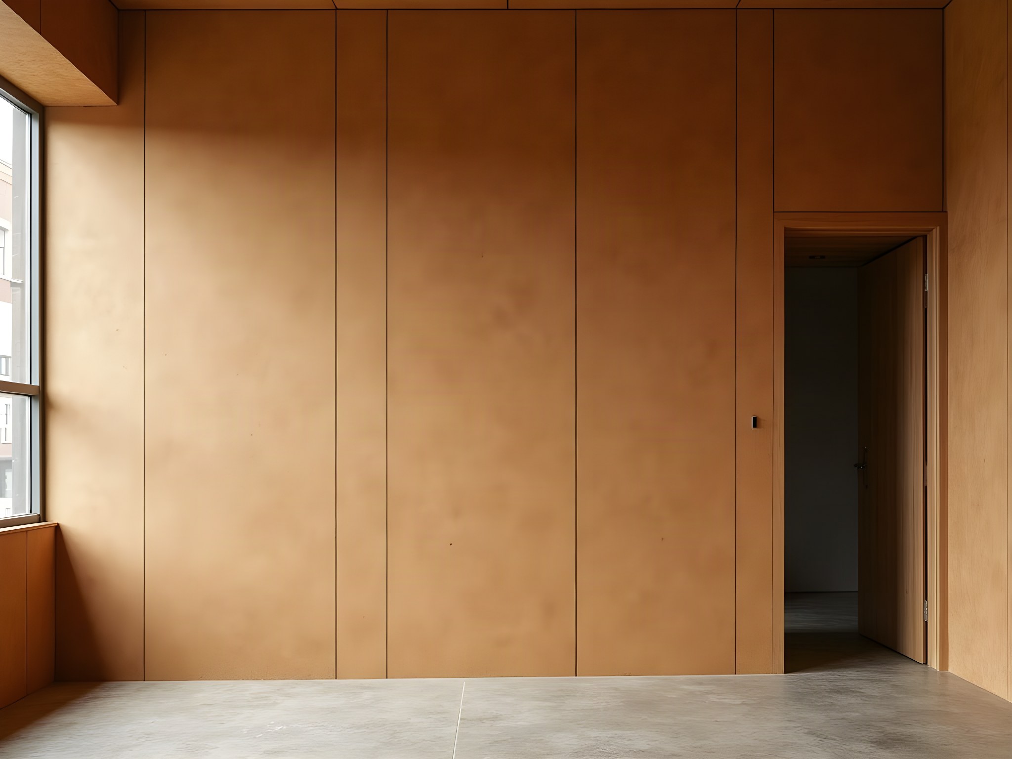
Direction A · the world of the material
“The invitation is a piece of the building.”
Cork insulation, ochre and granular, with everything pressed into it and no ink at all — because Ingrid kept every slab she could save and cut the rest into the bar front. The identity is not drawn onto the cork; it is a shape cut out of it. The guest feels it before reading it: a thumb over the impression at the door.
Anchor detail
“Nobody expects cork to be beautiful and it is the whole material story of this building.”
Where this could go at invitation stage
Choose Direction A if the thing you most want a guest to do is touch the paper.
Direction B · the world of the mark
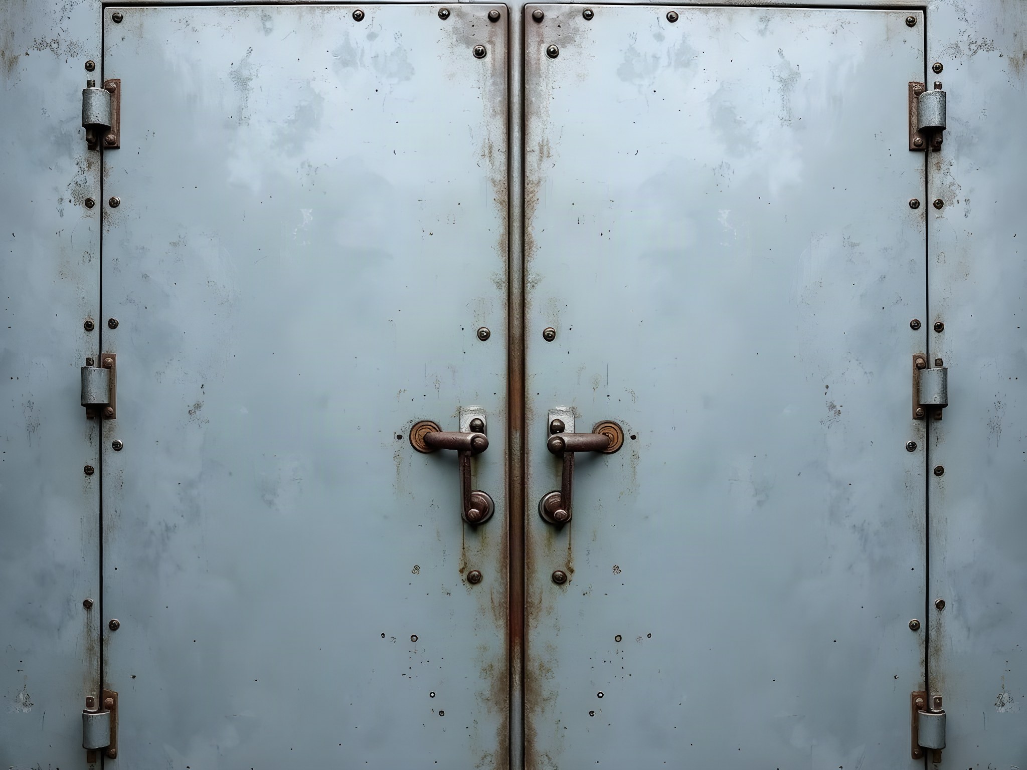
“The invitation is the door.”
A white mark sprayed through a stencil plate and bled at the edges — because the name on the cast-iron door has never been repainted, and Ingrid was right not to. The mark is reproduced, never redrawn; a cleaned-up vector version of it is explicitly refused. Ranged hard, like a shipping mark, because that is what it is.
Anchor detail
“The name is stencilled on the cast-iron door in white paint, and we did not repaint it.”
Where this could go at invitation stage
Choose Direction B if the building already said it and the job is to not get in the way.
The suite in this direction
Palette
The Salvage Slab
Cork slab ochre leads · bracken ink for words · one ember, painted on a cut edge and seen only from the side.
The Painted Mark
Ice owns the ground where the mark has to read; zinc owns the working paper and every word set on ice · stencil white reserved for the mark alone · one ember per piece, spent as a rule and never as a word.
Typography — Hanken Grotesk · Fraunces
Opening Night · 14 November
Direction A leads with Fraunces — a serif cut for paper, not for screens, because it holds an impression without ink behind it. Direction B leads with Hanken Grotesk set tight: a grotesk with no warmth to offer, which states the fact and stops, exactly like the door does. In both, the other family is demoted to tracked-caps support lines and never allowed to lead. Lining numerals throughout; oldstyle would be a different building.
Refused, on the client’s instruction
Approved
The cork direction was the more tactile object, and it lost on the strongest possible ground: the identity already existed. The door has carried this mark since 1911 and Ingrid had already made the only real design decision — not to repaint it. Direction B does the one thing that respects that, which is to reproduce it exactly and then get out of the way. The cork survives anyway; it is the bar front, and it is the reason the room is the colour it is.