Polka Dot Gala · Palais de la Lumière · Paris · Saturday, 21 February 2026
Pois de Fête
The dot as hero motif. Two ways to make a circle carry an entire evening.
Direction AObsession Blanche
Direction BMinuit Perlé
ChosenB
Where it started
The dot as hero motif. Two ways to make a circle carry an entire evening.
The dot is not decoration. It is architecture.
ClientThe House of Pois de Fête
CityParis
Event dateSaturday, 21 February 2026 · 19:30
DressBlack Tie · Dots Encouraged
VenuePalais de la Lumière — 17 avenue Montaigne, 75008 Paris
The brief, in one lineThe dot as hero motif — one circle, carried across eight pieces
The suite · eight piecesInvitation · Envelope Exterior · Envelope Liner · Cocktail Card · Menu · Programme · Place Card · Table Card
The type
Two hands, one obsession.
The worlds do not share a typeface, and that is the point. Obsession Blanche is set in Space Grotesk — geometric, precise, the letterforms built from the same circle as the motif. Minuit Perlé softens into Cormorant Garamond light italic, wide-tracked and barely whispering. In both, the dot repeats at every scale: from the period at the end of a sentence to the chandelier above the dance floor.
Display · BCormorant GaramondSoirée des Pois
Display · ASpace GroteskPOIS DE FÊTE
HeadingCormorant GaramondA celebration of form and precision
Event lineSpace GroteskSaturday · 21 February · 2026
CaptionCormorant GaramondMinuit Perlé — the pearl at midnight
BodySpace GroteskBody text flows with quiet authority. The dot motif repeats at every scale — from the period at the end of a sentence to the chandelier above the dance floor.
Direction A
Obsession Blanche
A
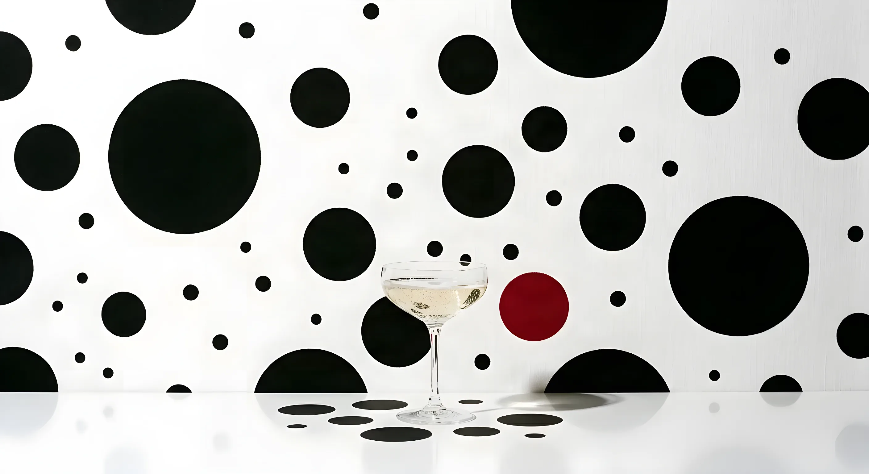
Graphic, stark and fearlessly minimal. This direction treats the polka dot not as decoration but as architecture — each circle is a deliberate act. A white linen world punctuated by jet black dots in wildly varied scales, with a single crimson circle placed like a comma in the wrong place. Exactly right.
Typography is precise and geometric. The event pieces feel like pages torn from a fashion magazine and laid on a tablecloth — smooth matte cotton stock, circles blind-embossed so they are felt before they are seen. The reference shelf is Helmut Newton, Vogue Italia, Comme des Garçons.
Obsession BlancheWhite linen ground, jet dots at wildly varied scale
Linen Blanc
#F8F5F0
Primary ground. Every piece begins on white linen — the dots are placed on it, never over it.
Encre
#0D0D0D
The motif itself. Jet dots at wildly varied scale, plus all typography.
Cramoisi
#C41E3A
One crimson circle per piece. The comma in the wrong place. Never a second.
Nuage
#E8E4DE
Derived — the shadow tone. Rules, panels, and dots that sit half a step back.
The voices, and the material
Space Grotesk 500 · display
DM Sans 300 · body
Smooth matte cotton · blind emboss
Choose Direction A if —
You want something bold, graphic and instantly recognisable. An aesthetic that could be featured in a design publication. Black, white, and one note of gold that arrives late.
✕ Warm or golden grounds
✕ Ornament for its own sake
✕ Soft-edged shapes
✕ Dots so uniform they read corporate
What this world had still to settle
Whether one crimson dot can be placed wrong on every piece. A comma in the wrong place, exactly right, is a judgement made once — and nine pieces need it made nine times without becoming a rule.
Whether blind-embossed circles survive at varied scale. Felt before they are seen is the material argument; the smallest dots are the ones an impression cannot hold.
Whether the fashion references belong on a party. Helmut Newton and Comme des Garçons is a sharp shelf to stand on, and it is a colder register than the evening may want.
Whether wildly varied scale has a floor. The dots are the architecture; nobody has said how small one may get before it stops being architecture and becomes texture.
Direction B
Minuit Perlé
B
Midnight with a pearl in it. Immersive, nocturnal, celestial — the dots become light rather than ink, luminous spheres floating in deep indigo like a private universe. Guests step into a Kusama infinity room that smells of tuberose. Champagne gold glints like distant constellations.
Typography softens into refined serif, wide-tracked, barely whispering. The materials carry the same shift: deep-dyed velvet envelope, pearlescent coated card. Where Obsession Blanche is a statement, Minuit Perlé is an atmosphere — the suite is more jewellery than stationery.
Minuit PerléDeep indigo, the dot carried as light rather than ink
Minuit
#0E0E2C
Primary ground. The night the pearls float in. Deep enough to make light behave like light.
Ivoire Perle
#F0EBE0
The pearls, and all primary text. Where the eye rests.
Or Rosé
#C9A96E
Signature accent. Distant constellations — rules, halos, the smallest dots. Reserved, never spread.
Cosmos
#1E1E42
Derived — depth and atmosphere. The lit part of the night sky, one step above Minuit.
The voices, and the material
Cormorant Garamond 300 Italic · display
Space Grotesk · caption
Deep-dyed velvet envelope · pearlescent card
Choose Direction B if —
You want guests to feel they have stepped into another world. Opulent, mysterious, immersive. An event they will describe for years — not because of what happened, but because of how it felt.
Quoted from this suite's own production spec — the stock the invitation was actually printed on. Surfaces are rendered from that spec, not photographed.
✕ Stark white grounds
✕ Hard graphic contrast
✕ Crimson accents
✕ Dots so subtle it reads generic dark luxury
What this world had still to settle
Whether dots can become light in print. Luminous spheres in deep indigo is the whole world, and pearlescent stock is the only thing that can do it — which makes the paper the design.
Whether a velvet envelope is postable. Deep-dyed velvet is the most tactile idea in either world and the least likely to survive a sorting machine.
Whether the Kusama reference can be evoked without being borrowed. An infinity room is a specific artist's work, and the suite currently leans on it by name.
Whether more jewellery than stationery is a compliment. It is written as the goal, and it is also the point at which a card stops being able to carry a date legibly.
The decision, as they saw it
Ink, or light.
A · Obsession BlancheB · Minuit Perlé
World A makes the dot ink
Printed, pressed, absolute. A circle you can feel with a thumbnail.
World B makes the dot light
Suspended, glowing, weightless. A circle you could walk into.
Same motif. Same obsession.
Completely different emotional arrival.
Side by side
Eight ways they differ.
A · Obsession Blanche
B · Minuit Perlé BUILT
Mood
Graphic, stark, editorial, precise
Immersive, nocturnal, celestial, opulent
Palette
White linen · jet black · a single crimson
Midnight indigo · champagne pearl · rose gold
Typography
Space Grotesk geometric + Cormorant editorial serif
Can read as generic dark luxury if the dots are too subtle
References
Helmut Newton · Vogue Italia · Comme des Garçons
Yayoi Kusama · Dior midnight · Van Cleef & Arpels
The feeling
A motif so elemental it stops being playful.
A polka dot is the easiest motif in the world to make cute, and the hardest to make serious. So we tested each world on one question only: what does a guest feel in the first second, before they have read a single word?
Direction A feels like
“Walking into a Helmut Newton photograph and realising you are the only colour in the room.”
Direction B feels like
“Floating through a Kusama infinity room at midnight, every surface a mirror, every dot a star.”
Creative declaration
What we committed to — and why.
Both directions share one truth: the dot is not decoration. It is the event itself. Every piece, every surface, every shadow is a circle. The guest does not attend a party — they enter a world defined by a single, obsessive form.
The motif
One form, every scale
From the period at the end of a sentence to the chandelier above the dance floor. Nothing on the suite is a circle by accident.
The single accent
One crimson dot · one gold glint
Each world is allowed exactly one note of drama. A crimson circle in A, a rose-gold constellation in B. A second one would cancel the first.
Scale contrast
Never a uniform grid
Dots are set in wildly varied sizes and deliberately uneven placement. A regular polka-dot pattern is the failure state — it reads as wrapping paper.
The materials
The stock carries the direction
A: smooth matte cotton with blind-embossed circles you feel before you see. B: deep-dyed velvet envelope and pearlescent coated card.
References honoured
Newton & CDG · Kusama & Van Cleef
Present as discipline, not as pastiche — the editorial nerve of one, the infinite-room immersion of the other.
What we avoided
No confetti, no whimsy, no clip-art
No balloons, no bunting, no cartoon spots. Nothing that lets the dot slide back into party-shop territory.
Direction B · Chosen
Minuit Perlé
Minuit Perlé was chosen — light, not ink. Eight pieces carry the dot from the invitation to the chandelier.