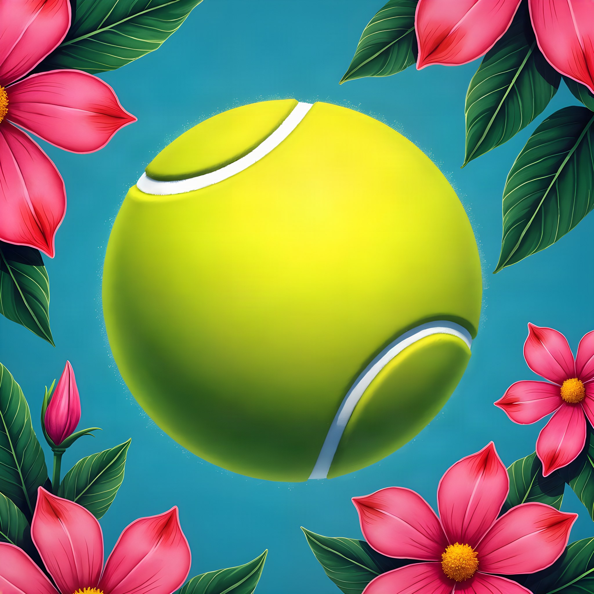
00 is the cover as it stands today, mounted live from the delivered page so it is the real thing and not a redrawing. 01–10 are the alternatives. Every one of them opens on the same artwork at full bleed — assets/tennis_dir_b.jpg — and every one is set in this suite’s own approved typefaces (Playfair Display + DM Sans). What changes between them is where the words go. Nothing here is published and nothing on disk has been altered.
The cover being replaced
The suite exactly as delivered, mounted live from its own approved page. It is here so the ten below have something to be measured against, and it is the only section on this page that is not new work.

Seven pieces · One carries a name
Everything on the bottom edge
The title sits on the floor of the frame and the facts run along the very bottom in one line, so the whole upper picture is left alone. The most conservative of the ten and the closest relative of the cover it replaces — tightened rather than rethought: one type block, one baseline, nothing floating.
What it costsIt concedes the bottom third to type, which on a picture whose subject is low in the frame is the wrong third to concede.

Seven pieces · One carries a name
A small block, one corner, maximum picture
The type is treated as a mark applied to the artwork rather than a layer over it: a compact stack in the top-left at stationery scale, with a hairline under it. Roughly 88% of the frame is untouched picture — the highest of the ten.
What it costsA cover this quiet asks the photograph to carry the whole introduction. On a suite whose artwork is a flat pattern rather than a scene, there may not be enough there to carry it.

Seven pieces · One carries a name
Symmetrical, on the optical centre
Eyebrow, title, line, sub — centred and stacked on the optical centre, with the facts spaced across the foot. The formal answer, and the one that reads most like an engraved card. It wants a picture with a calm middle.
What it costsDead centre is where most photographs put their subject, so this is the architecture most likely to land the title on the busiest part of the frame.

Seven pieces · One carries a name
All type ranged right, in the right third
Every word is pushed into a column down the right-hand side and ranged right against the edge, so the picture reads left to right and finishes at the type instead of underneath it. The facts hang under the title in the same column.
What it costsRanged-right setting is unforgiving of long names: a title that wraps to three lines starts to look like a list.

Seven pieces · One carries a name
Title across the top, picture entire below
The title runs the full width of the frame along the top with the facts in a rule-separated row beneath it, and everything below that is picture with nothing on it at all. A newspaper front page: the name is furniture, the image is the story.
What it costsFull-width setting drives the title to a size the artwork has to survive, and the top strip of a photograph is often its emptiest.

Seven pieces · One carries a name
A narrow measure, full height, left
A single column about 26 characters wide runs the full height of the left edge — eyebrow at the top, title on the centre line, facts stacked at the foot. The vertical rhythm belongs to the type and the horizontal one to the picture.
What it costsIt splits the frame 1:3 by implication, which a portrait-shaped subject sitting on the left will fight.

Seven pieces · One carries a name
The title opened across two corners
The title is broken in two and set at opposite corners — the first half top-left, the second bottom-right — so the eye crosses the whole picture to finish reading it. The facts settle under the second half.
What it costsIt only works on a title that has a natural break. On a single short name the two halves read as two unrelated labels.

Seven pieces · One carries a name
The date enormous and quiet, the title exact
The year is set at the largest size on the page in outline, low and wide, and the real title sits small and precise above it. The picture reads through the numerals. The only one of the ten where the biggest thing on the cover is not the name.
What it costsAn outlined numeral is a shape before it is a number, and on a busy photograph it can read as damage rather than as type.

Seven pieces · One carries a name
The picture is the cover; the words annotate it
The artwork is presented as a plate and the type as its caption: a hairline, then a small justified block at the bottom-left holding the name, the line and the facts in one measure. Museum labelling rather than titling.
What it costsIt deliberately under-sells the name. On a suite whose whole point is the client's name, that restraint is the wrong instinct.
Tracked capitals across the middle
One line of widely tracked capitals straight across the middle of the frame, with the eyebrow pinned to the top edge and the facts to the bottom edge — the two extremes held apart by a single band of type. The most graphic of the ten.
What it costsTracked capitals across a full width need a short name. Anything long either shrinks below its own dignity or wraps and loses the band.