Event Identity Document · Confidential
Direction B
Event Identity · Valentina Moreau
§ 01 — The Event
§ 02 — The Moodboard
Direction B · Chosen
The invitation as a still life — something Valentina would keep on her shelf long after July.
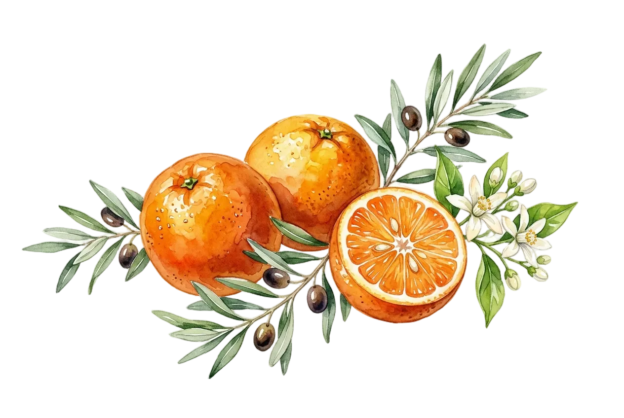
Warm linen ground, hand-painted citrus — oranges, lemons, olive branch — over cobalt gingham. The colour is joyful and alive, but arrives through texture and illustration rather than graphic force. Intimate. Handmade in spirit. The kind of invitation guests tuck into a drawer and find again years later.
Watercolour citrus, olive branch, white blossom — the central illustration of Direction B
Mood
Direction A vs Direction B
| A — The Cobalt Terrace | B — The Still Life (chosen) | |
|---|---|---|
| Ground | Deep cobalt blue — the card is the architecture | Warm linen — the card is the table |
| Typography | White reversed-out on cobalt — bold, graphic | Charcoal on linen — intimate, legible |
| Illustration | Citrus as accent against the blue ground | Hand-drawn citrus, botanical, gingham texture |
| Guest reaction | Held at arm's length to admire | Held close, kept long after the night |
| Mood word | Architectural warmth | Mediterranean domestic |
| Paper finish | Matte laminate — vivid, saturated cobalt | Uncoated natural — textured, warm |
Choose B if —
Valentina values the crafted over the loud — the illustration on linen arrives as a gift in itself. Warm, collected, something guests keep.
§ 03 — Colour Palette
Linen
#F2EBE0
Primary ground · All stationery surfaces · The afternoon light
Burnt Orange
#E84822
Signature colour · Dividers · Milestone text · The orange
Grove Green
#3A6B35
Labels · Eyebrows · Table numbers · The olive branch
Cobalt
#2B52C8
Gingham pattern · RSVP block · Structural accent only
Charcoal
#2A2218
Primary text · Guest names · Display headings
Burnt Orange is the signature accent. It appears on milestone typography, divider lines, and decorative dots. Never as a background fill.
Grove Green is reserved for labels and eyebrow text. It reads as a quiet organisational signal — never for display headings or body copy.
Cobalt exists only as the gingham pattern and the RSVP block tint. It must never appear as a text colour or solid field outside these uses.
Linen is the ground. All stationery surfaces are Linen. The canvas background (Warm Taupe #D0C8BC) is only for staging — never appears in print.
§ 04 — Typography
§ 05 — The Illustration
Watercolour on white — oranges, olive branch, white blossom, cut citrus
Usage Across the Suite
Invitation
340 × 200px · centred above title · full opacity · botanicals facing down
Menu Card
200 × 120px · centred header · full opacity · smaller scale
Place Card
90 × 90px · top-right corner · 65% opacity · cropped to corner
Illustration Rules
Never crop below the midpoint of the central orange — the half-cut citrus face must remain visible at all sizes
Always used on linen ground — never placed on cobalt, orange, or any solid colour field
The gingham pattern and the botanical must never overlap — one provides structure, the other warmth
Do not add drop shadows, borders, or vignettes to the illustration — the white cut-out edges are intentional
§ 06 — The Gingham Mark
Construction Rule
§ 07 — The Suite
Every piece below is the delivered artwork, not a mock-up of it. The panel is live: put a name in it and watch each piece that carries a name take it, exactly as it does in a real print run. The pieces that read the same for the whole room carry no name at all — and each one says so.
The pieces are listening.
The primary communication piece. Botanical centred above the text; cobalt gingham ribbon frames the card top and bottom. Oslo-style watermark optional for personalisation. Guest name line left open for personalisation.
The guest line above is the one the platform sets — {{GUEST_NAME}}. Beside it, each guest's own code, generated live and genuinely scannable. It is not printed on this delivered design; it belongs to the reply card and the door.
Five-course evening menu with wine note. Smaller botanical at the top; Cormorant for course names, italic for descriptions. Cobalt tint box for the sommelier note. Gingham top and bottom.
A6 landscape tent-fold. Front face: table number in Grove Green, guest name in Cormorant italic at 38pt, botanical corner accent. Back face: event reference printed upside-down. Gingham left-edge stripe on the front.
Quinta da Luz · 19 July 2026
Valentina · 40
Table 3
Sophie Arnaud
19 July 2026 · Quinta da Luz
Quinta da Luz · 19 July 2026
Valentina · 40
Table 1
Marc Fontaine
19 July 2026 · Quinta da Luz
Quinta da Luz · 19 July 2026
Valentina · 40
Table 2
Élise Moreau
19 July 2026 · Quinta da Luz
Quinta da Luz · 19 July 2026
Valentina · 40
Table 5
Thomas Vidal
19 July 2026 · Quinta da Luz
A6 landscape reply card, enclosed with the invitation. Guest circles attendance; dietary notes left open for handwriting. Botanical corner, cobalt tint reply box. Returns by 30 June.
A5 portrait tent card. Number set in Cormorant Garamond at display scale — legible across the table. Gingham top ribbon, botanical lower-right corner, event reference in Grove Green at foot. Shown as a set of three.
A5 portrait standing card on the bar and cocktail tables. Welcome aperitivo, a signature cocktail named for the evening, curated wines and soft options. Same botanical header as the dinner menu — smaller, lighter.
Large landscape display board at the estate entrance. Botanical centred; event name in full display scale. Doubles as a seating announcement — guests collect their place card from the welcome table on arrival.
A6 landscape note card, dispatched within a week of the dinner. Botanical upper-right, thank-you verse from Valentina in Cormorant italic. Blank lower panel for a handwritten line. Gingham top strip only — lighter than the invitation.
DL insert for the mailing envelope. Cobalt gingham covers the full liner face — the pattern that lives as a ribbon on every other piece here becomes the whole interior. Monogram VM in Cormorant italic, nothing else. The surprise when the envelope is opened.
Each of the nine designs above becomes a personalised, print-ready file for every guest on the list — at the true trim size, with the backgrounds and the fonts the printer expects.
Two of the nine pieces carry a name. The rest read the same for the whole room, so they print once — and each one says so above.
Each guest's own code opens their own page. The same code, read at the door, marks them arrived — so the host knows who is in the room without a clipboard.
The same card, at the same guest's link, with a reply panel drawn into it. Not a separate digital version in a different style — the design itself, continued.
§ 08 — Production Notes
Invitation Card
Menu Cards
Place Cards
Colour Conversion
The Mediterranean Still Life · Event Identity · 2026
Valentina Moreau · 40th Birthday Dinner
Quinta da Luz · Private Estate · 19 July 2026
Design by Evorrah
Confidential · Not for distribution