Direction A · the world of words
Written Up
Nothing on this paper is a picture. It says what came in and who brought it — the boat, the grower, the garden at Rinsey, the hour the crab landed — lettered big enough to mean it, the way a market stall writes its produce up instead of drawing it, because the honest thing about your food is not what it looks like, it is where it came from that morning.
- Words instead of pictures
- Name the boat, the grower
- Two colours, printed flat
- Ranged left, like a list
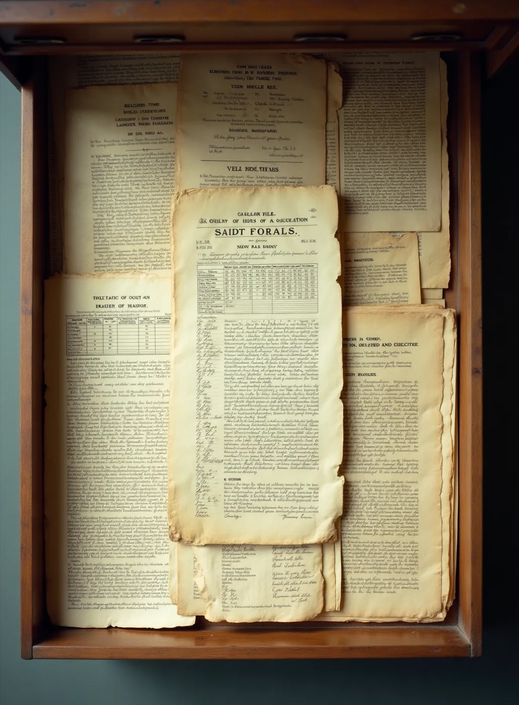
Market bills, tabulations and merchants' sheets: printed to be read once and thrown out, and better looking than most things made to last. That is what the whole suite borrows from — useful first, handsome by accident.
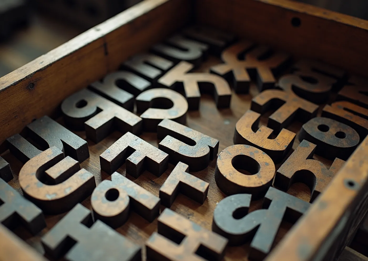
Letters loose in the case, never spelling anything. What the restaurant owns is the kit, not any one sheet, so a new piece is a rearrangement rather than a new commission, for years.
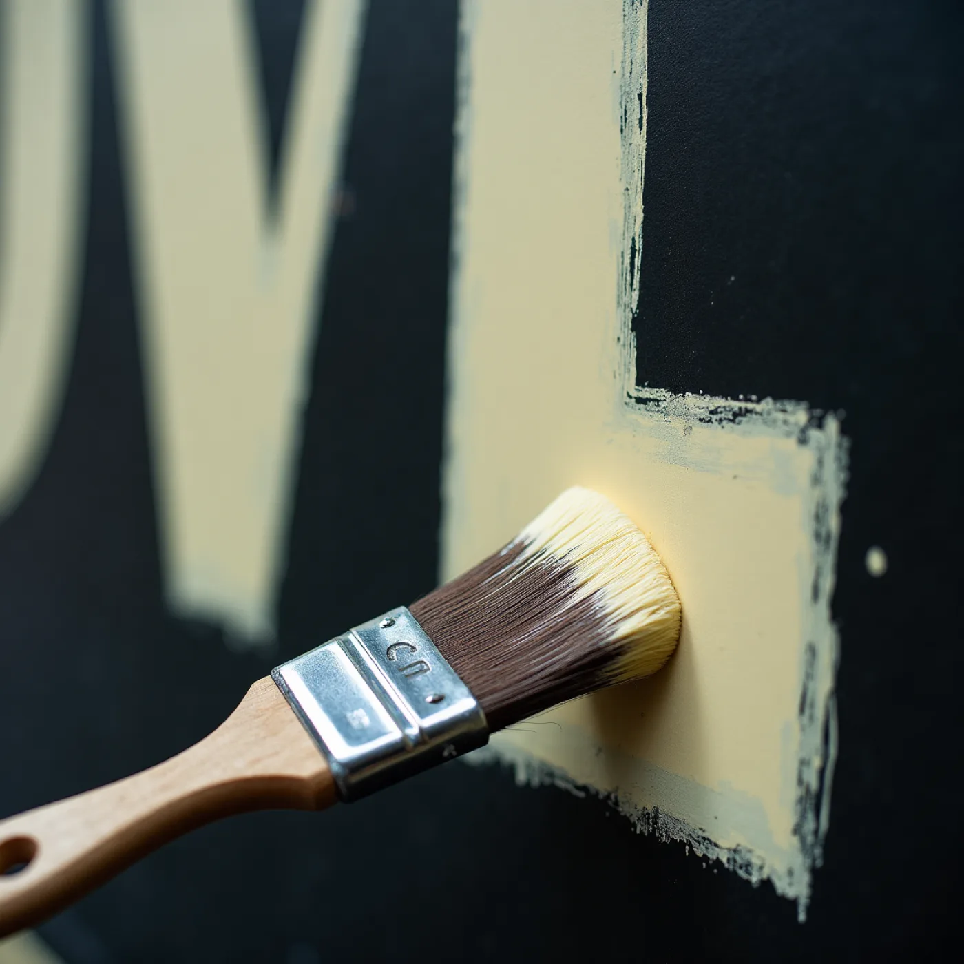
Made at the size it prints. The weight of a letter belongs to the board it is painted on, and nothing here is drawn small on a screen and scaled up afterwards.
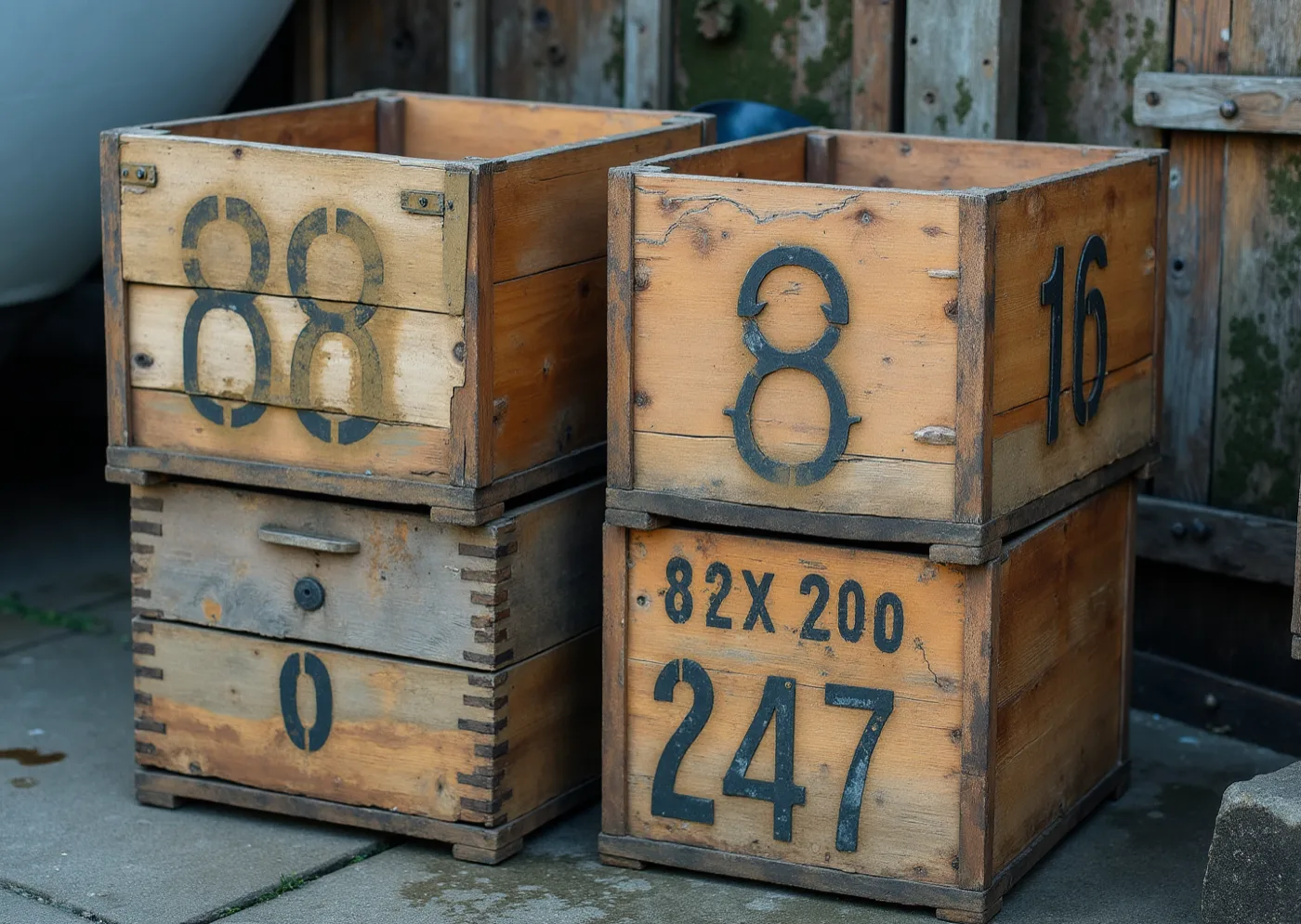
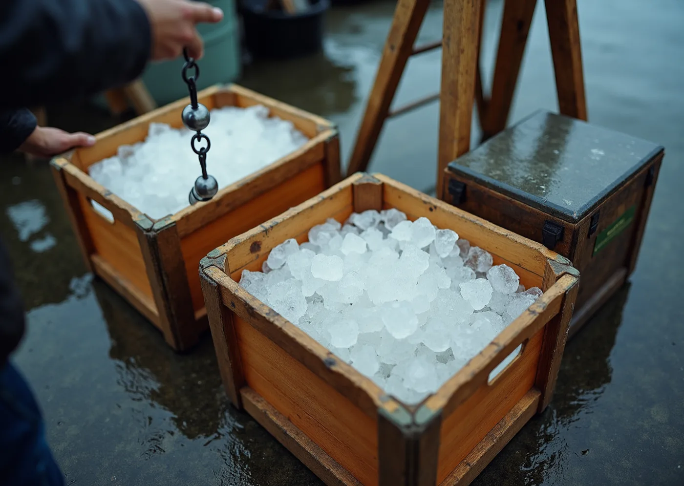
Lettering made for one job by people with no interest in lettering. This is where the plainness comes from — the crates, not a chalkboard. It is also the line this world has to keep walking, and your brief bans the other side of it by name.
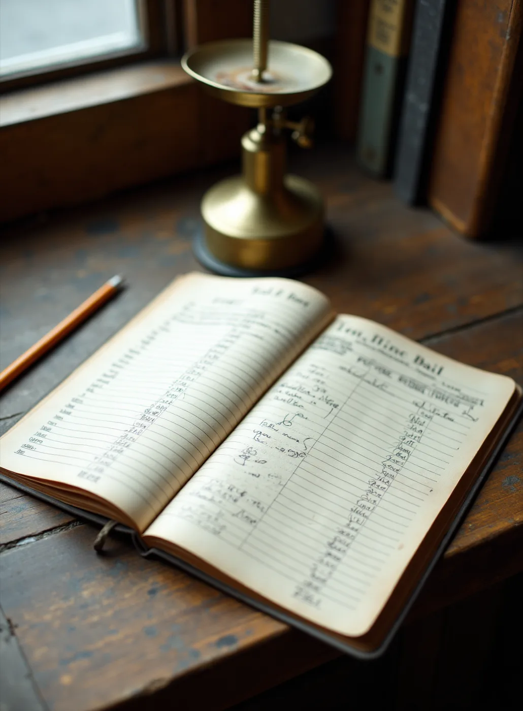
Your suppliers already write all of this down every morning. The invitation is that document made properly: ruled, listed, and specific about who brought what.
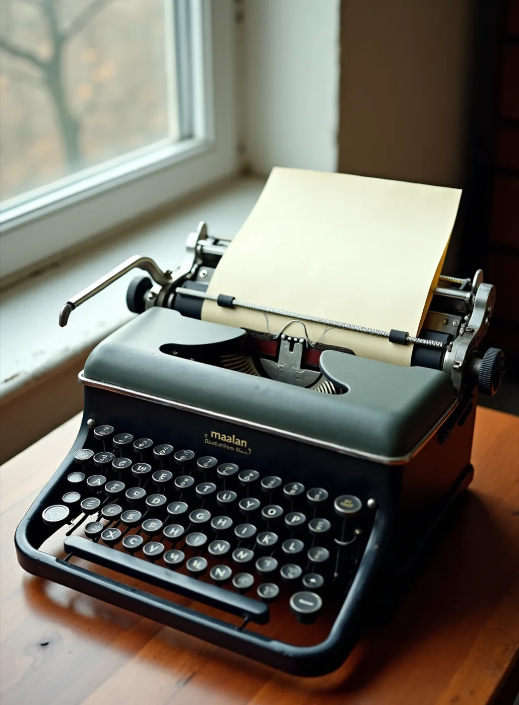
The layer that changes with the tide should look cheap and be cheap. A day's list costs a keystroke and a sheet, so nothing that lasts is ever reprinted just to say what came in today.
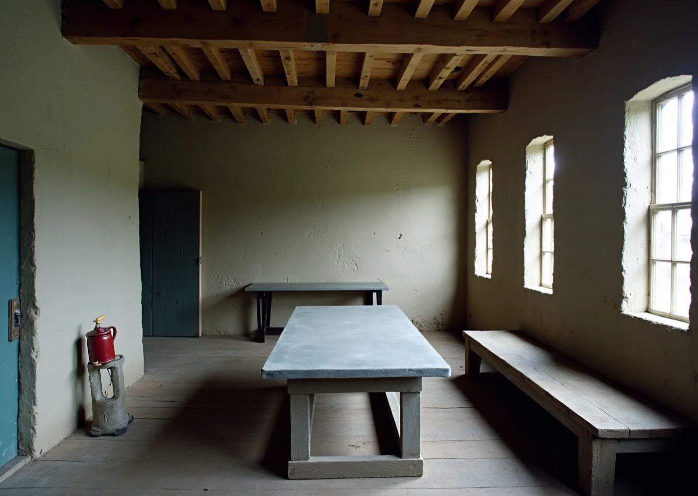
Your own room, before anything is hung on it. Lime, timber, deal and zinc are already this severe, and paper made only of words agrees with the walls instead of decorating them.
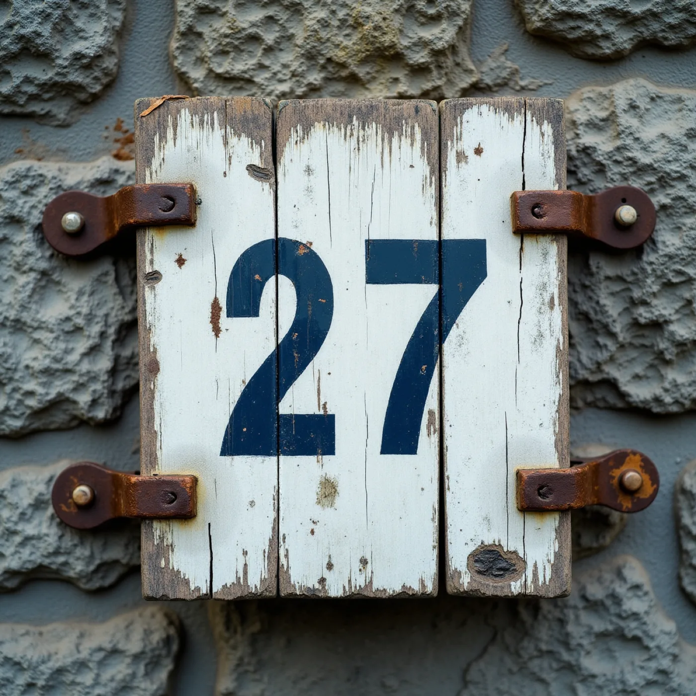
Painted to be read across a harbour, and what survives the weather is the number. Whatever is largest lasts longest — which is why size and position are the only hierarchy this world gets.
The job, in numbers
- Scope
- Nine pieces · sixty covers · one evening
- The invitation
- 99 × 240 mm · 540gsm bill board · two colours
- The day's list
- A5 · light sheet · reprinted whenever the boats change it
- The welcome board
- 500 × 700 mm · enamel on primed timber, painted by hand
- Artwork locks
- 30 April 2027 — the painted board first of all
Type specimen
display — Hanken Grotesk 800, set in one size only, tracked tight and printed flat at full strength.
support — the same face at half the size, tracked open and ranged left, the way a bill states its second fact.
detail — the same family again at 400, lower case, generously leaded, because a long list read by candlelight wants an even colour and no character at all.
One family, worked from one end of its weight to the other: loud enough to be read from the quay, quiet enough to carry a wine list at a table. The contrast is scale and weight, not decoration, which is the only contrast a room this plain will take.
Materials & production
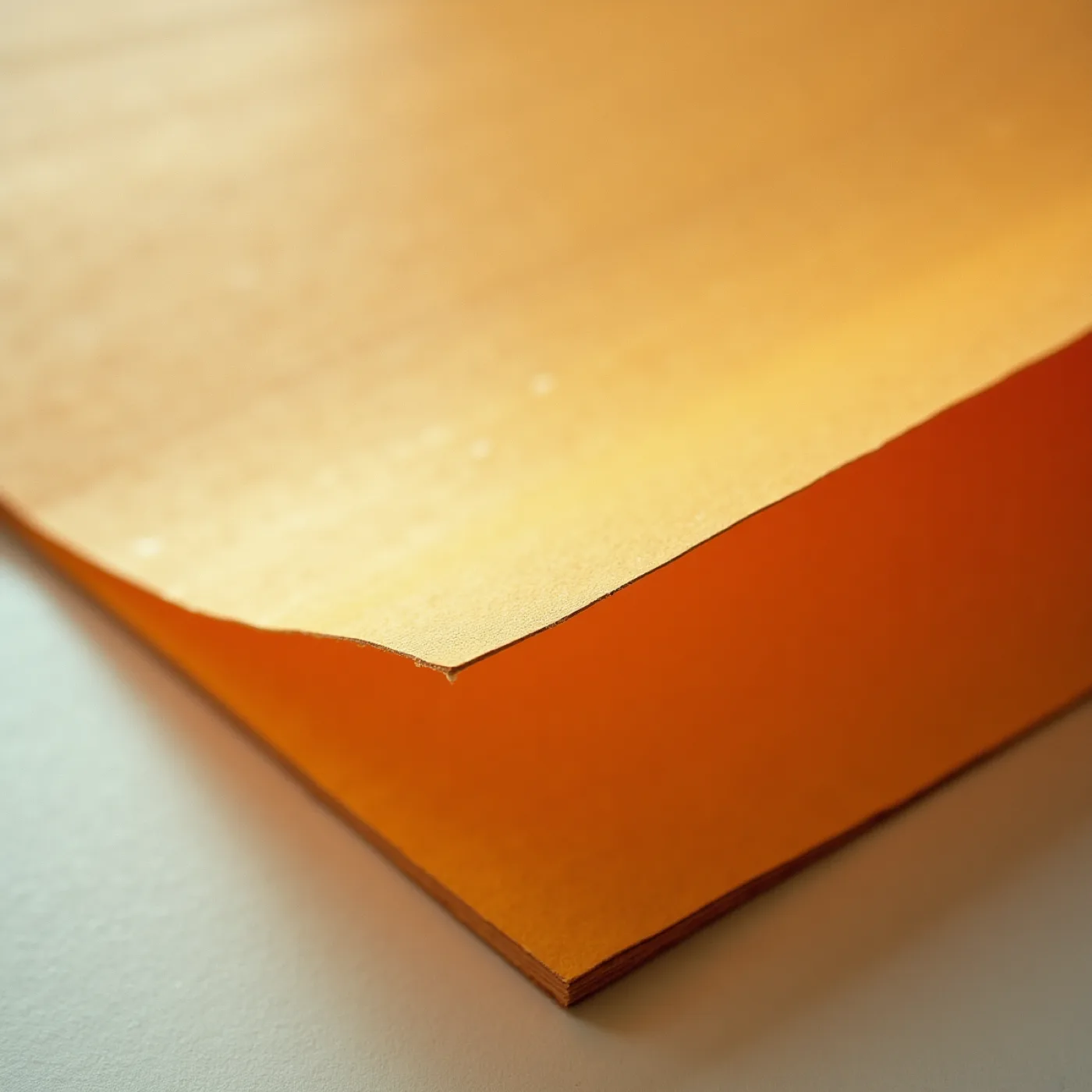
Warm uncoated stock at two weights, and the split is the idea: a heavy board around 540gsm for the invitation, place cards and table names, and a light, frankly cheap sheet for anything that changes — the daily list, the wine list — because a working document should look like one and should cost nothing to reprint. Letterpress where the lettering is the design, so the impression is the only ornament; flat litho where a piece is mostly words. Colour prints as flat areas at full strength rather than as tint, which is what lets a two-colour job read from the harbour wall. No foil, no varnish, no emboss. The welcome piece is painted rather than printed — signwriter's enamel on a primed board — which at 500 × 700mm is both cheaper than a print and the only piece in the suite genuinely made by a hand at full size. Two production cautions carried from the direction: a painted board cannot be re-proofed, so its layout locks earliest of all nine pieces; and heavy flat colour on cheap stock shows through, so the light sheet has to be tested double-sided before the daily list is committed to it.
What this world actually makes
Three objects, described rather than drawn: the paper you would be holding on 21 May, the sheet that gets reprinted whenever the boats change it, and the one piece painted by a hand at full size. Each is set in the type, colours and stocks named above.
A bill for one dinner: what is coming, who is bringing it, where and when, ranged left, the largest thing read first.
Two stocks, and the split is the idea. Heavy board for what lasts; a light, frankly cheap sheet for anything that changes.
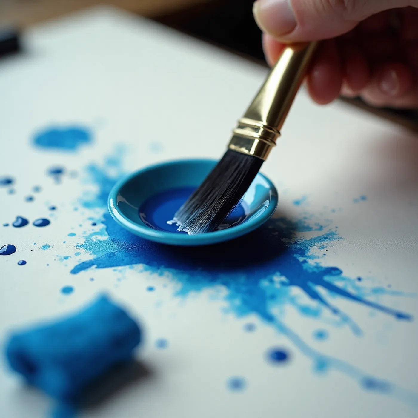
The welcome board is painted rather than printed — enamel on primed timber, the one piece a hand makes at full size. The six coast names are lettered the same way.
The same sheet with nothing to load. No image means it survives being screenshotted and forwarded, which is what actually happens to an invitation on a phone.
They read who caught it and who grew it before they sit down, and the table they are put at is a stretch of coast they already know.
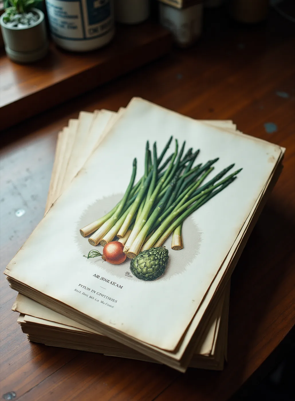
Where Rinsey goes. In a world with no pictures the only way to honour your grandmother's garden is to say it: a table name, and a line of type naming where the asparagus came from. Plainer than a drawing, and it can name a person, which a drawing cannot.
Why there is no picture at all. You ruled out plated food and every nautical device. This takes the picture out entirely — nothing to date in a year, nothing to be misread as a seafood restaurant, and the words left carrying the room.
- Whether the lettering is bought, painted or drawn. Real wood letter proofed and scanned, a signwriter's hand, or a face drawn once that you then own outright. They differ by thousands of pounds and by whether your kitchen can extend the suite itself afterwards, and nothing can be costed until it is settled.
- Whether the second colour can carry anything. Measured against the bill stock, the poster orange reads at 3.05:1. That is enough for a field, a rule or a numeral the size of a hand, and not enough for a line anyone has to read. So nine pieces are carried by one ink and by size alone, and that has to stay interesting as far as the ninth.
- Whether a painted sign can be got right first time. A 500 × 700mm board painted by hand cannot be re-proofed. It has to lock earliest of the nine, well before anything printed, against a 30 April delivery, so it carries more of the schedule's risk than its size suggests.
- Whether a paper with no picture reads as an invitation. A bill announces; an invitation asks. Sixty people who know you may open this and take it for a notice about a dinner rather than an invitation to one, and nobody has put it in front of a stranger yet.