Alice Harper & Antoine Bernard
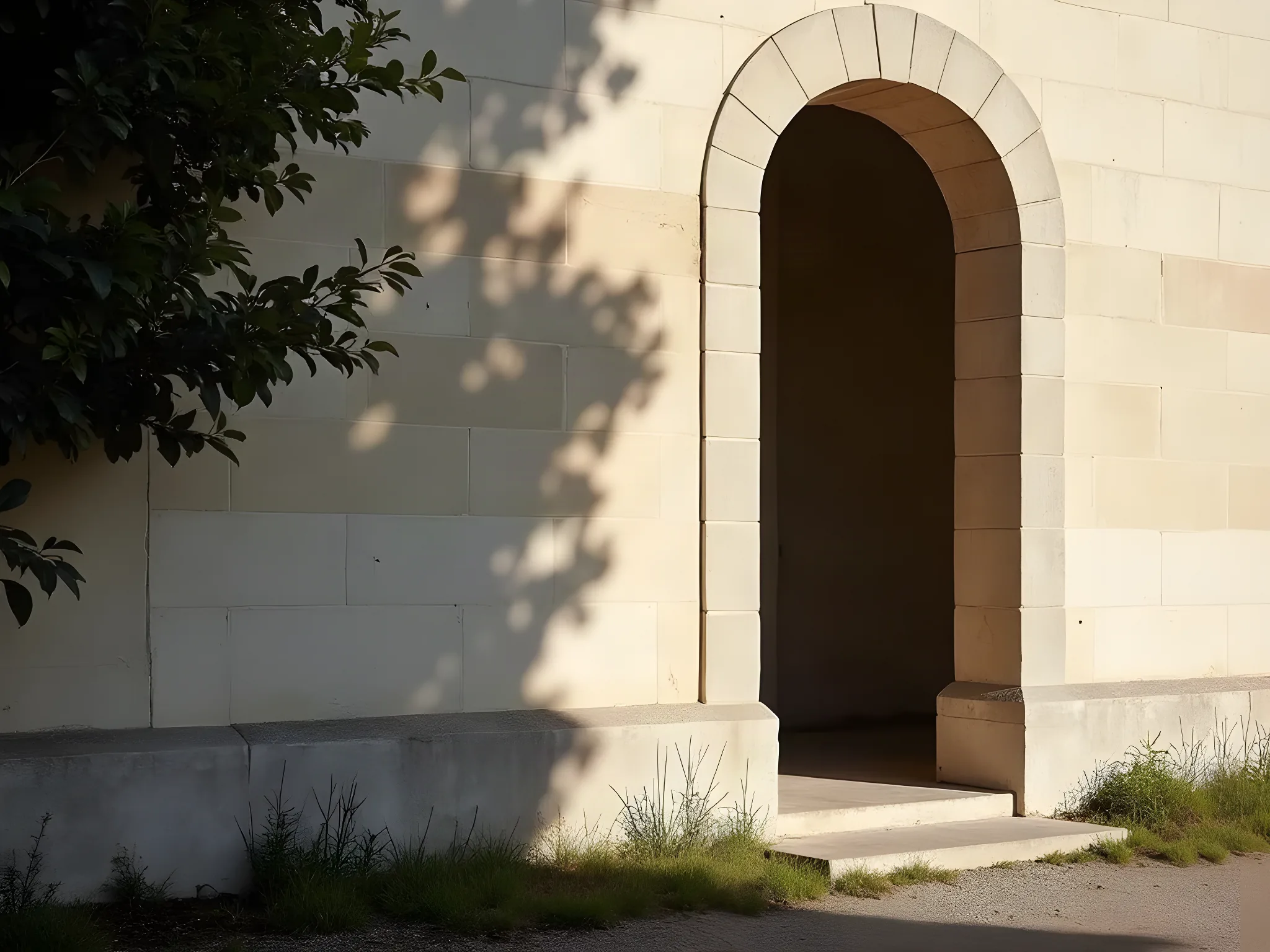
A wedding at Château de Vaux-le-Vicomte, Maincy — the fifteenth of October, two thousand and twenty-six, at six in the evening.
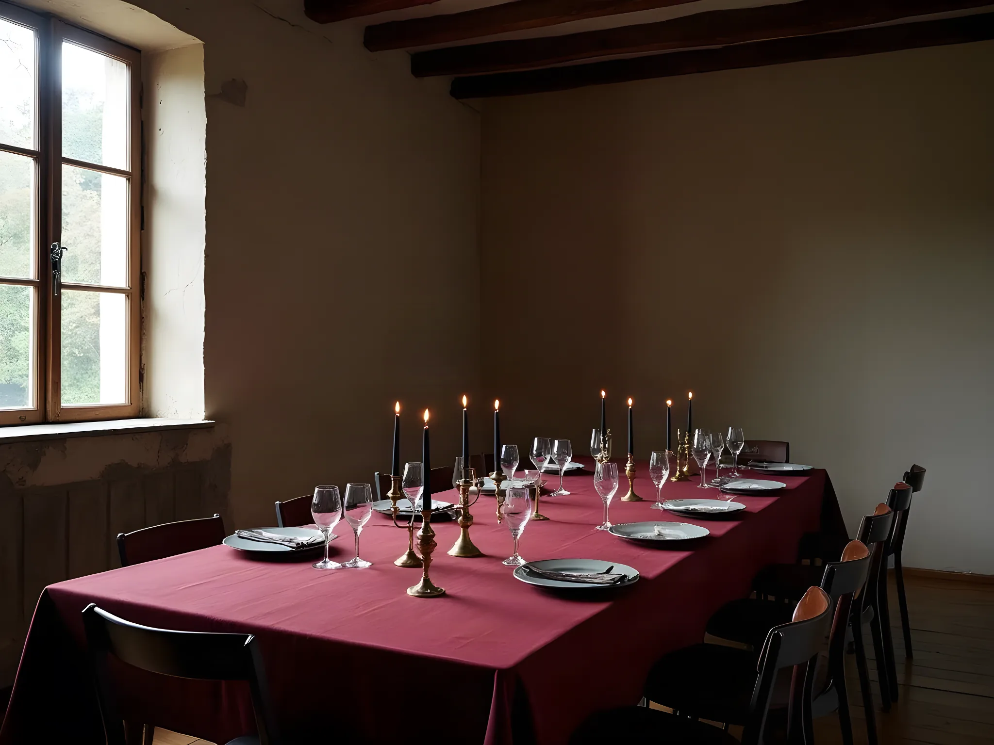
“An autumn wedding at the most beautiful garden in France. October light through stone windows. Two people who chose each other deliberately. The design should carry the weight of that choice — and nothing heavier.”
Where it started
One October at Vaux-le-Vicomte, told two ways. Autumn is not one season — it is a soft one and a severe one, and both are true of the same fortnight. We have not tried to reconcile them. Each world below is given room to be fully itself.
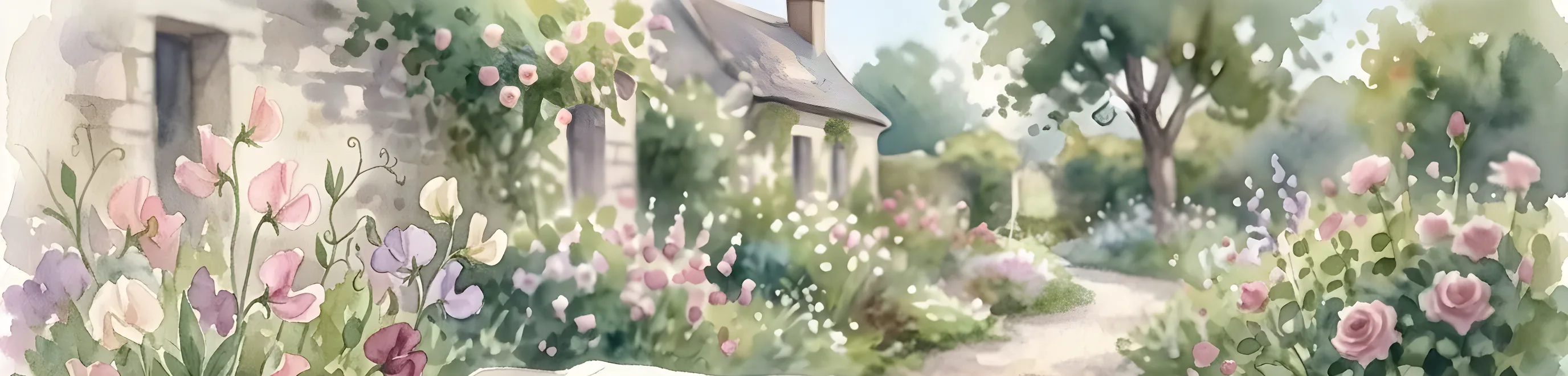
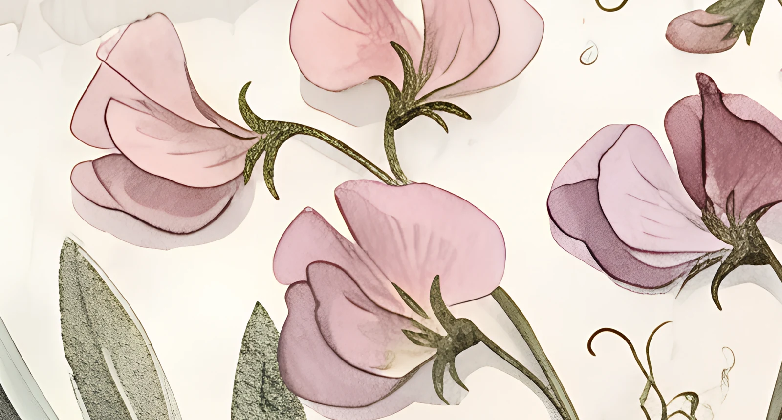
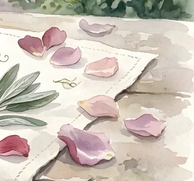
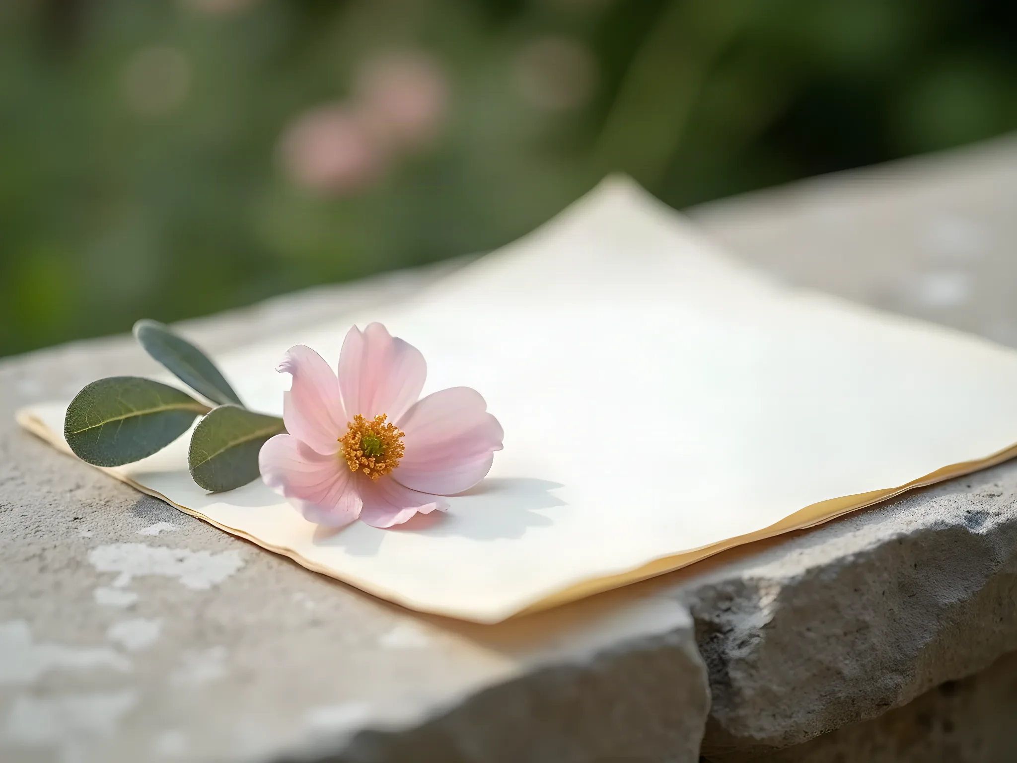
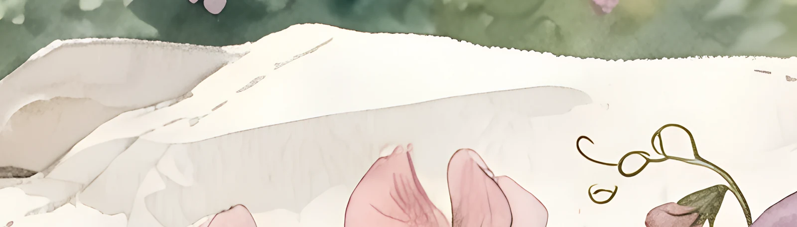
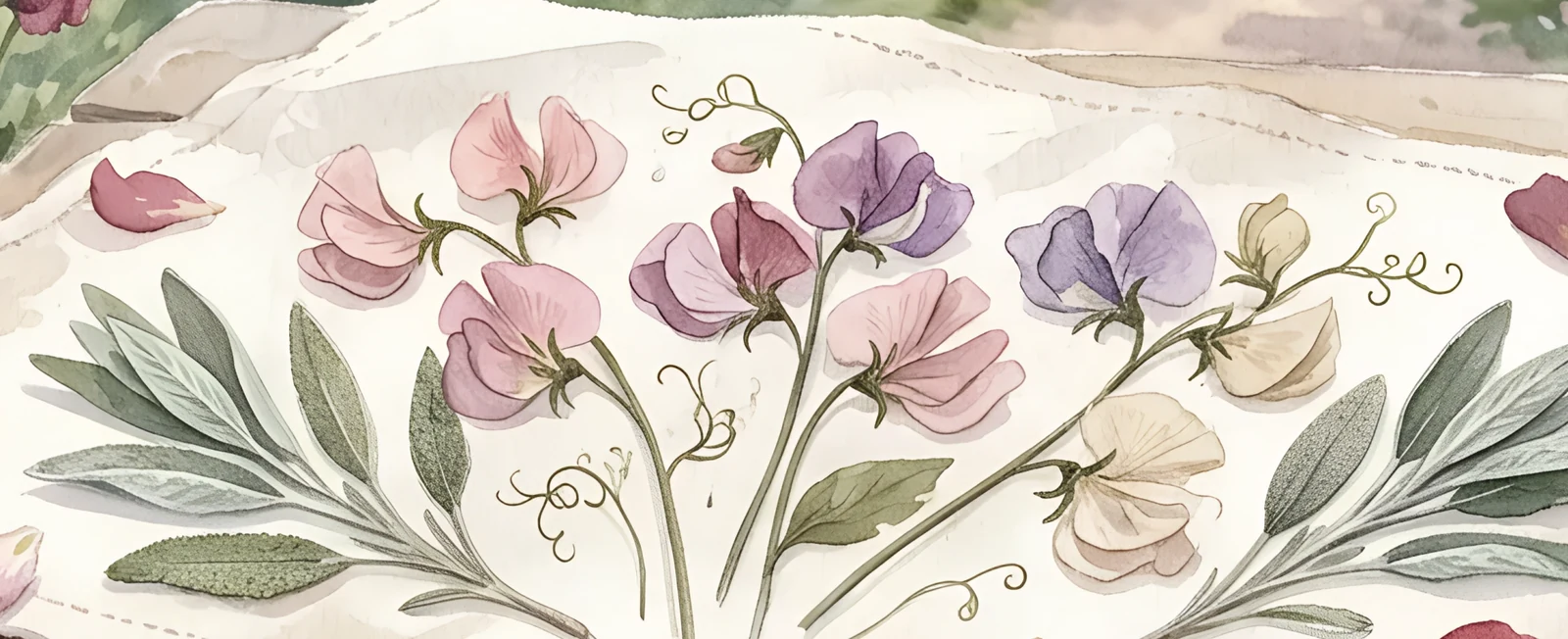
The gardens at Vaux-le-Vicomte seen through pressed glass — colours lifted from sweet peas and wild sage, typography that moves like handwriting on a letter found in a drawer. This direction leans into the romance of the season before it turns. Soft, personal, impossibly tender.
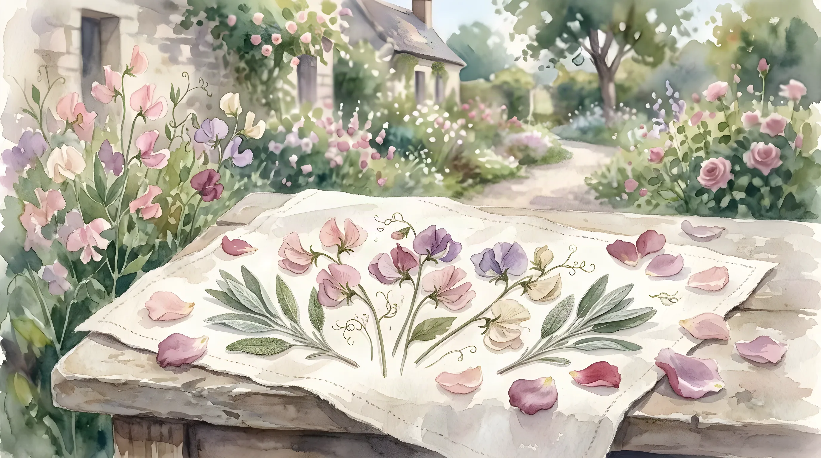
Blush and mauve are imagery colours and will never be used as text — on ivory they read at 1.5:1 and 2.7:1. Sage is the same: it draws, it does not write. Anything a guest has to read is bracken.
Type specimen
Display · Dancing Script. Chosen because it is a hand and not a calligraphy — it moves the way a letter written quickly moves.
Body · Cormorant Garamond, italic. Light, slightly narrow, old. It carries the practical lines without ever raising its voice.
Two families and no more. Dates are written out in words; the weekday is left off entirely.
The fullest painting of the six, and the largest clearing. The names are the biggest thing on the card; everything practical sits under them in the bare sheet.
The smaller the piece, the less the clearing can do. Below a certain size it stops reading as a device at all — so the painting simply takes the whole card, and the name stands in it.
The one place the painting is allowed to be loud: a liner printed edge to edge in botanicals, carrying no words at all.
The botanicals hold their own side and the reply panel takes the clearing. A light world throughout — this one never goes dark.
They meet the garden before they meet the couple: flowers, then a name, then a date, then a place.
The same October, twice
A · Jardin Romantique
B · Récolte Éditoriale
Drag the divider. Neither of these is the safe choice — they simply disagree about what October is.
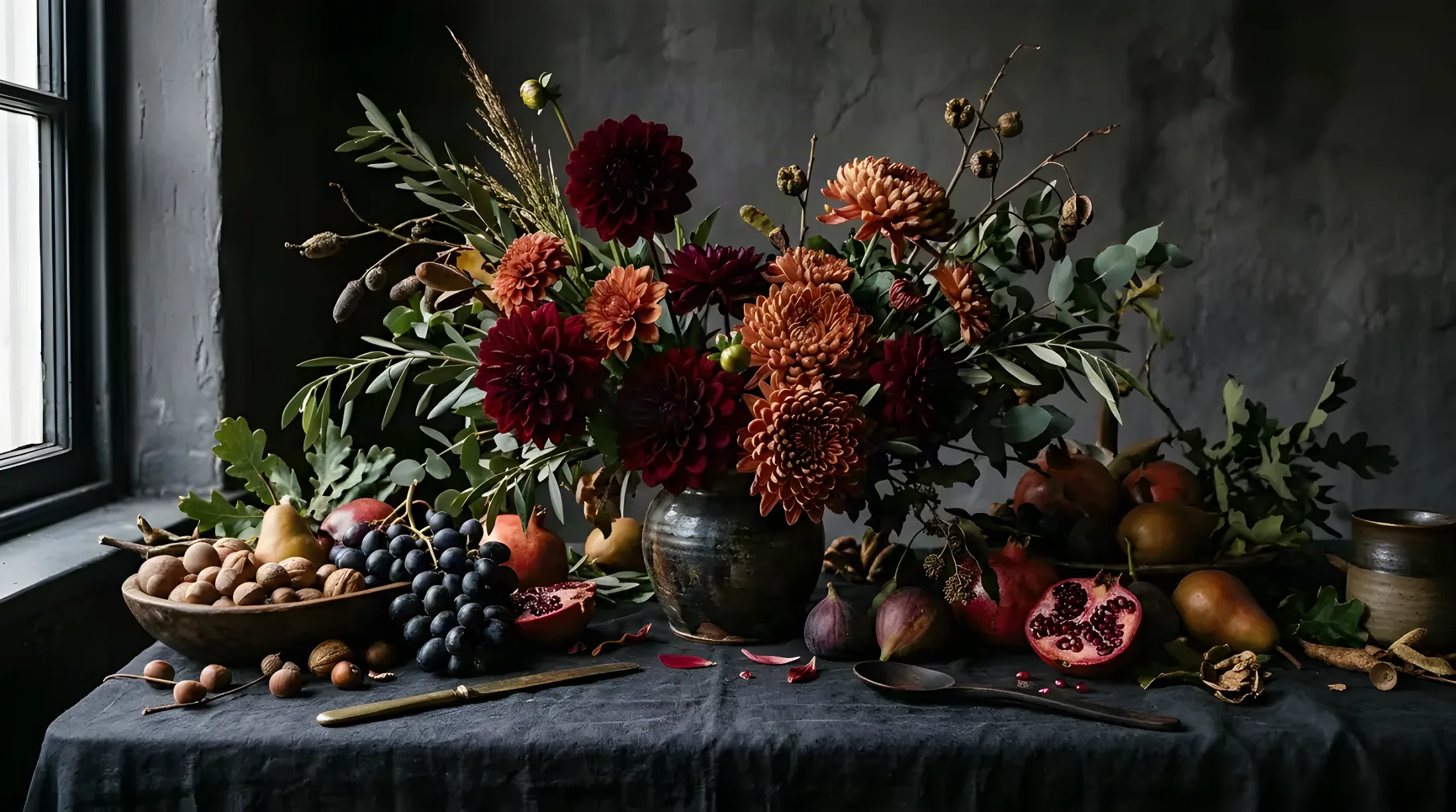
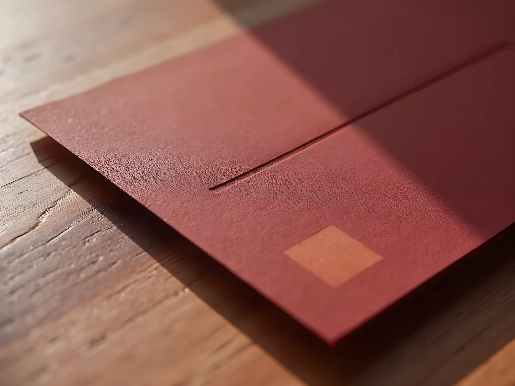
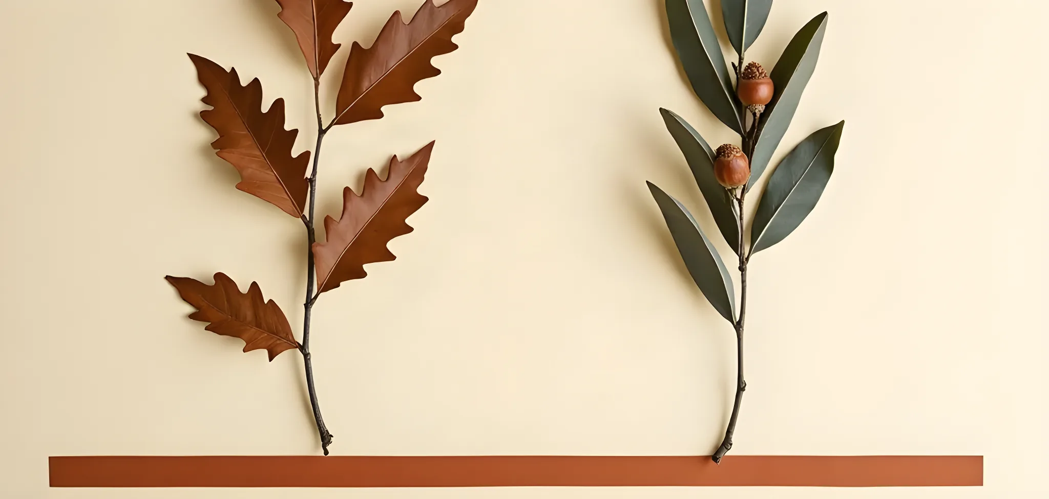
This is October as Kinfolk sees it — not a soft season but a dramatic one. Burgundy that carries weight. Terracotta that warms without warming. Olive that grounds everything. The typography is editorial, the shapes are architectural, and every card feels like it was art-directed the same week as the harvest. It is autumn, but it has been to Paris.
The inversion of World A, exactly: there the paper is pale and the ink is dark; here the paper is dark and the ink is pale. Burgundy is a field, never a letterform.
Type specimen
Display · Playfair Display 900. A masthead weight. Names are stacked and set large enough to read as a shape before they read as words.
Body · Cormorant Garamond 300. Deliberately thin against it — the contrast between the two weights is the whole editorial gesture.
The same two-family discipline as World A, arguing the opposite case.
A cream inner card inside a burgundy envelope. An editorial column, a Playfair header, one terracotta rule and no illustration at all.
Crisp cream tent cards, the name in Playfair italic, a burgundy corner rule. Geometry does the work that flowers do in World A.
Deep burgundy, lined in a restrained repeating harvest mark — the only place this world repeats anything.
A dark page. Cream type on burgundy, the rule holding the column, the photography full-bleed and cold.
They meet the authority first: a dark envelope, a name at masthead scale, and only then the evening.
The decision, as they saw it
Your wedding is the season before it turns — soft light, open windows, flowers from the garden, letters you keep. You want it to feel tender, not dramatic.
Your wedding is autumn with authority — rich colour, sculptural arrangement, editorial restraint. You want it to feel considered, not decorated.
| A · Jardin Romantique | B · Récolte Éditoriale | |
|---|---|---|
| The season | The week before it turns. Warm, open, still flowering. | The week after. Cut, gathered, brought indoors. |
| The ground | Ivory cotton rag with a deckle edge — pale, soft, thick. | Burgundy card dyed through — dark, flat, hard-edged. |
| The colour that leads | Sweet pea blush, and it leads in the painting rather than the type. | Burgundy, and it leads by being the whole surface. |
| The typography | A hand — Dancing Script over a light italic Garamond. | A masthead — Playfair 900 over a thin Garamond. |
| The ornament | The botanicals themselves. Nothing is drawn on top of them. | One terracotta rule per piece. Nothing else at all. |
| Where the words sit | In a clearing the flowers leave for them. | In a column the rule holds open for them. |
| What the guest keeps | Something that looks pressed and saved. | Something that looks published. |
| The risk | Tenderness at a vast château can read as small if the paper is not weighty enough. It has to be printed heavy. | Authority is easy to overdo; one degree too far and the evening reads corporate rather than considered. |
Alice and Antoine kept the garden. Six pieces were built out of this world — the same pressed botanicals massed to one side of every card, and every word standing in the clearing they leave behind.
See the finished suite →Fully developed and genuinely available — the harvest world would have made a beautiful and quite different wedding. It is not a weaker second option; it simply answers a question this couple did not ask.