Direction A · the world of printed things
Ementa do Dia
You have been keeping other people's menus since you were nineteen and then apologised for mentioning it — that box is not nostalgia, it is the everyday paper of places that feed people, and after a hundred Sundays Rua da Bica is quietly one of those places. This world prints your dinner the way they print theirs: an ementa, the day's menu, issued for the eighth of November, in English like the table. Nothing drawn, everything listed.
- Nothing is drawn
- Formats borrowed, never invented
- Size means reading distance
- The second colour is paper
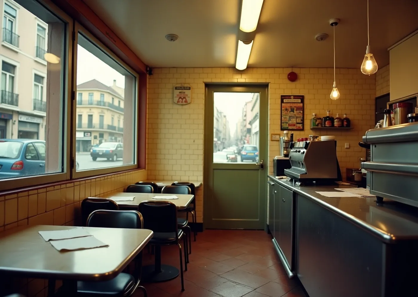
A room that feeds people every day is equipped rather than decorated, and the paper on its tables is stock rather than styling. Nothing in there was made to be kept, which is the argument for printing your hundredth exactly like it.
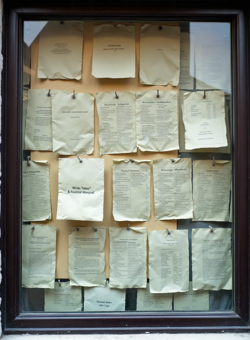
Cheap coloured paper is how one ink has always afforded a second colour: the sheet does the work a second pass would charge for. And nobody has ever had to be taught how to read a notice, which counts at a table where English is the language everybody happens to share rather than the one anybody chose.
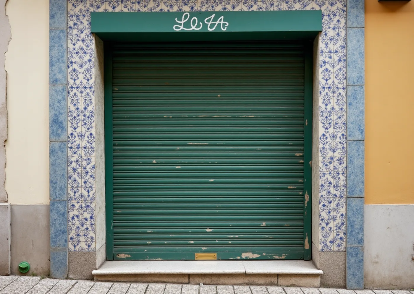
Condensed, tight, unspaced — painted that way to fit the fascia, not to look expensive. It is the exact opposite instinct to the letterspaced capitals you ruled out, and the more interesting one, because it comes from having to fit rather than from wanting to impress.
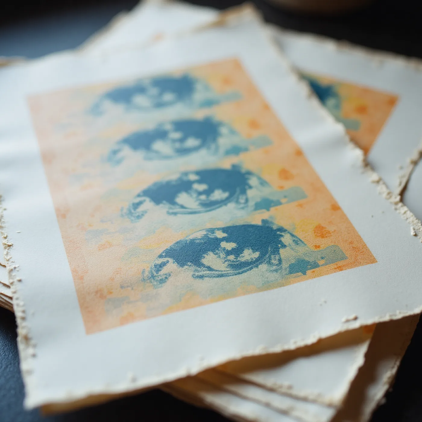
Misregistration, starved ink and a furry cut edge are not damage; they are what one-colour duplication does, and the printer in the flat will do a version of it whether or not anyone plans for it. The argument is that a world like this should want that rather than survive it.
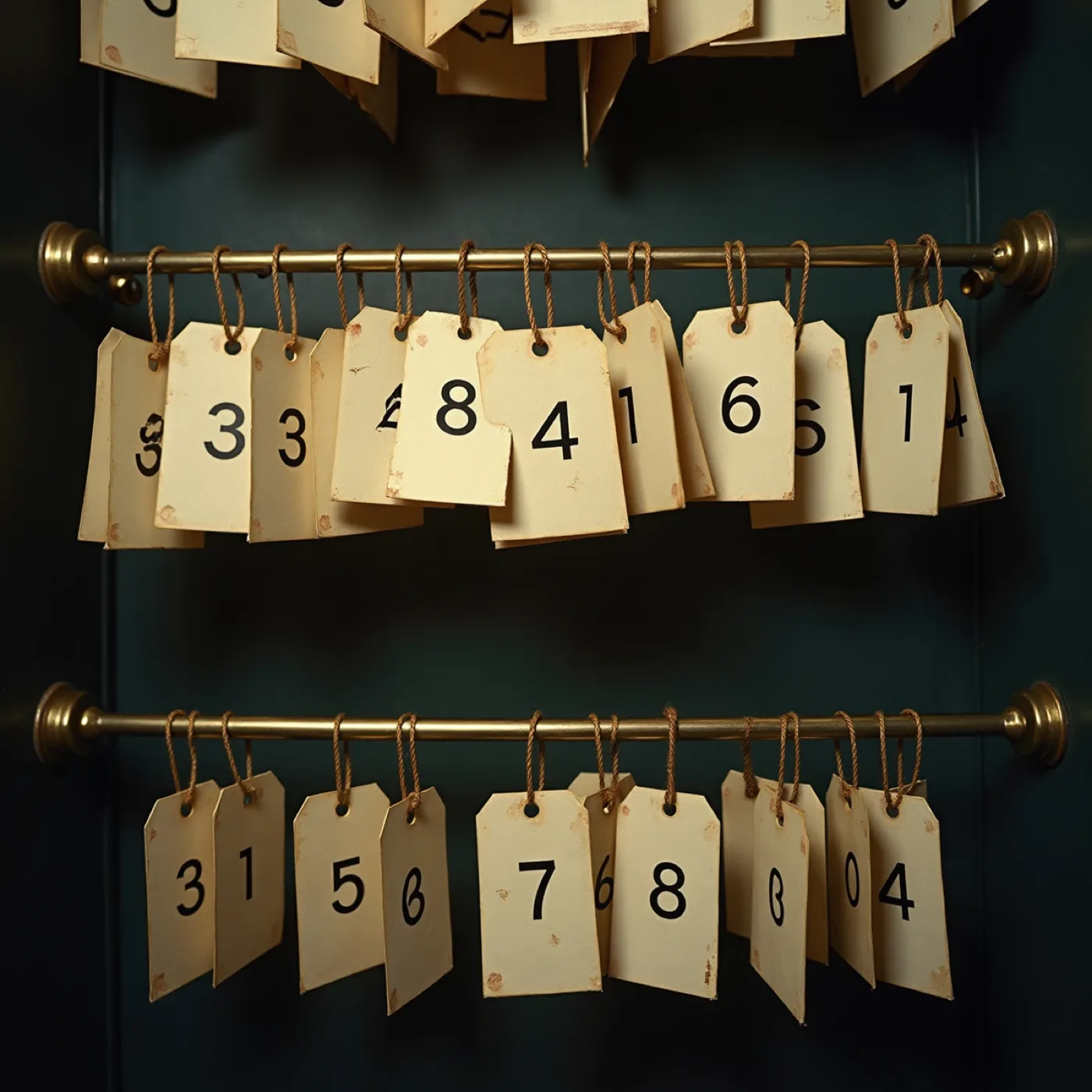
Twenty-six people and fourteen honest seats: somebody has to be told where to go or the whole thing jams. Being issued something confers a place without ranking anybody, which is how the Ironing Board stays an honour people ask for instead of the last seat left.
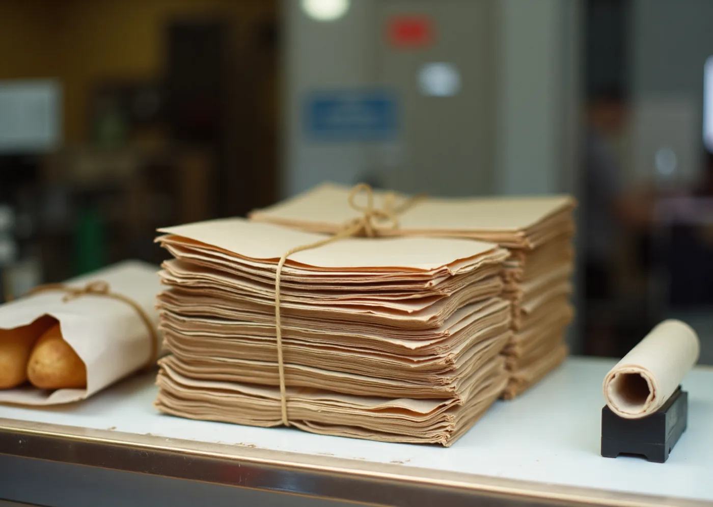
Every format in this world already exists as an object: a bag, a tied parcel, a strip torn off a roll, a stamp. Borrowing means no piece has to justify its shape, and somebody who has never been to the flat knows what a thing is before reading a word of it.
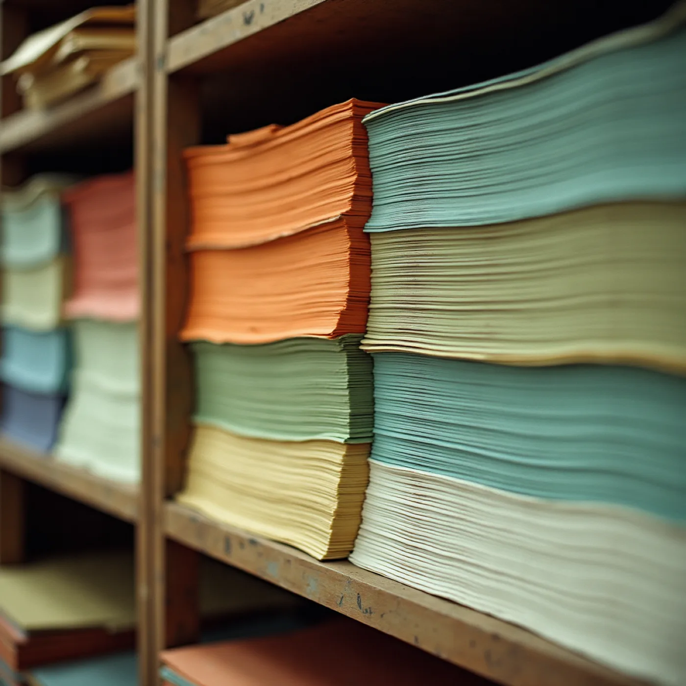
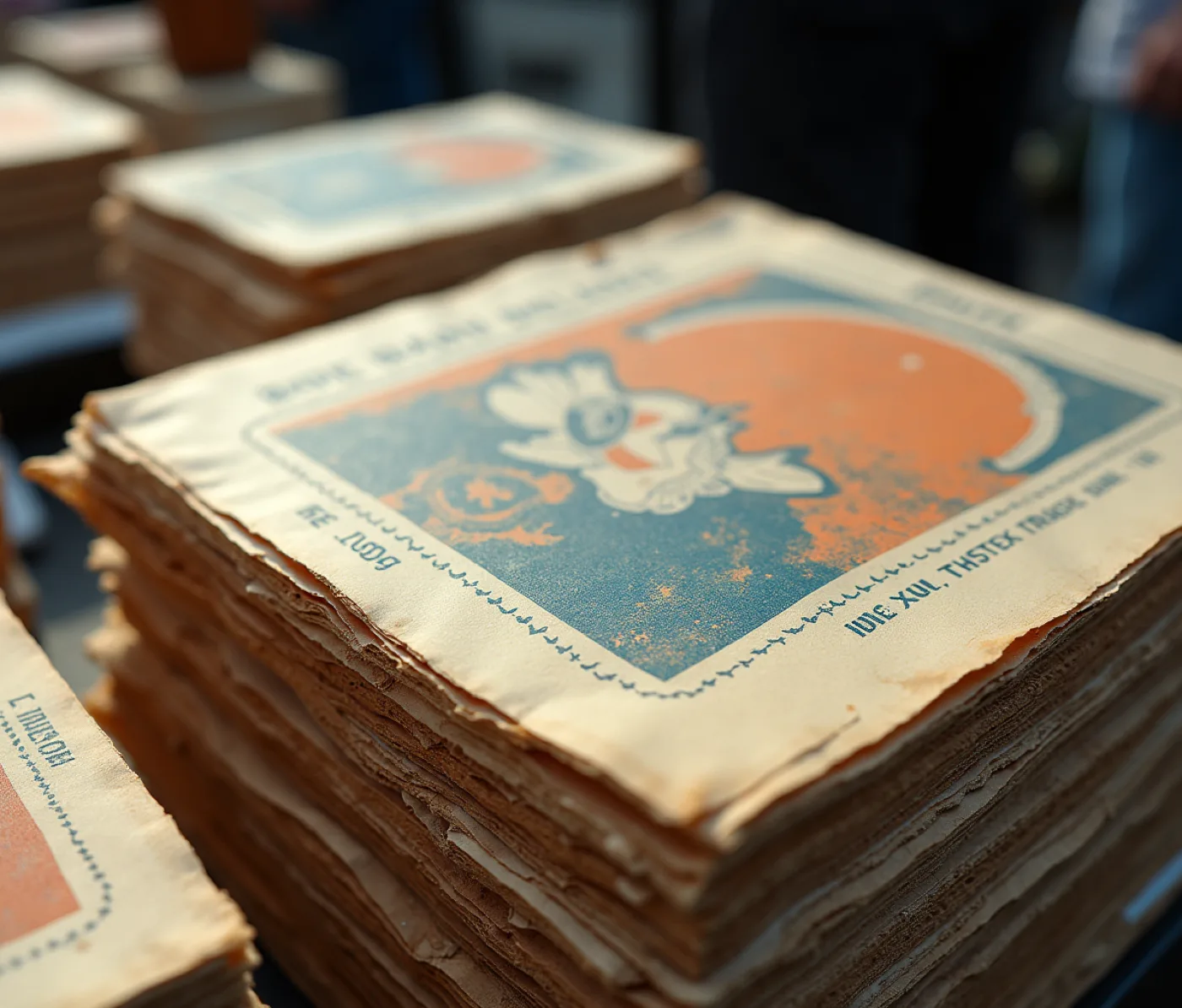
Here the second colour is something you buy and carry home — flat, cut, stacked and priced. It argues that the loud orange of the pot can enter the suite as paper rather than as ink, which is the truest strong colour a home printer will ever put on a page.
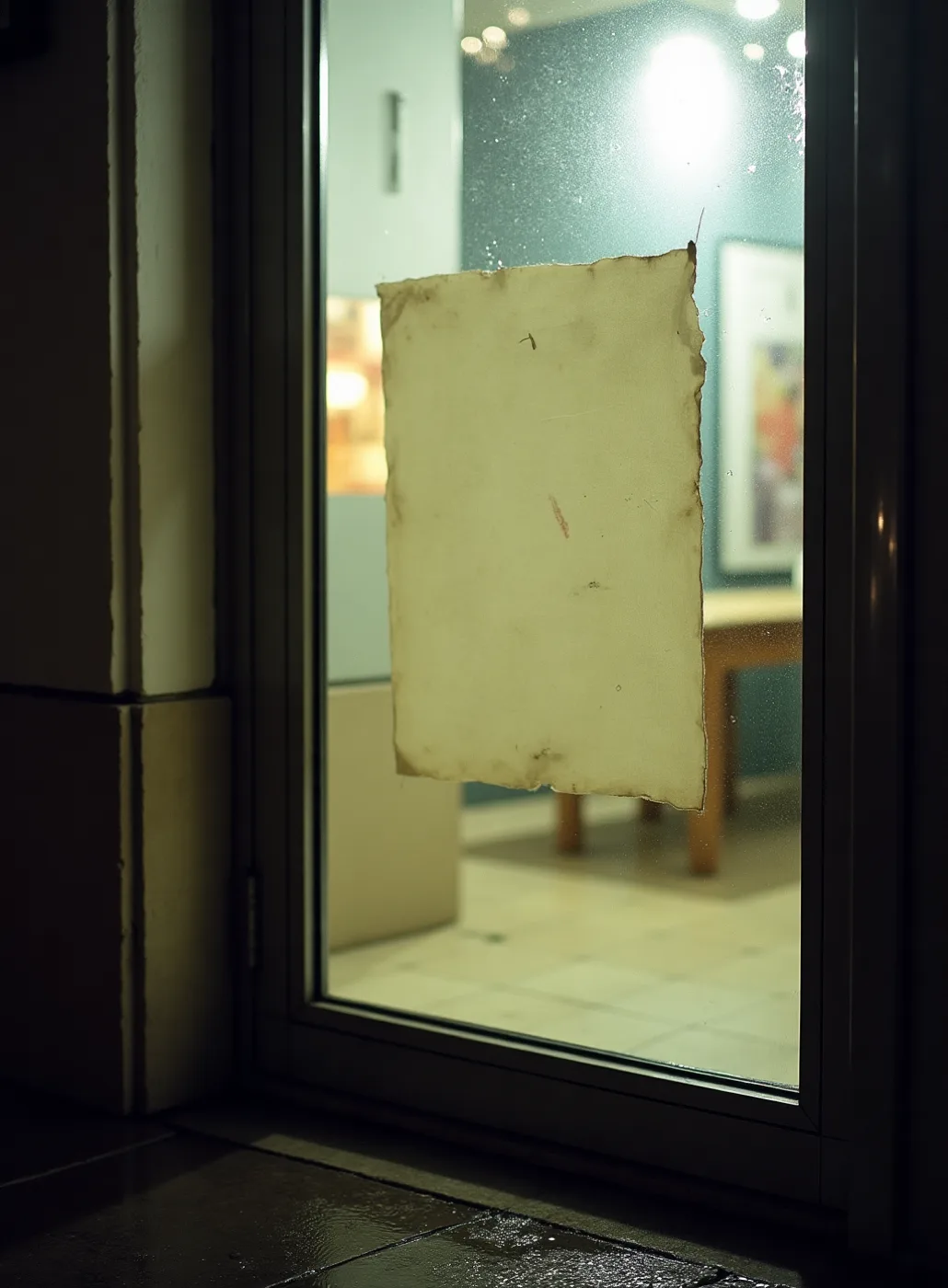
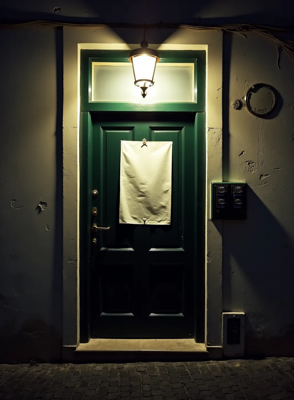
The condition the largest piece has to survive: taped to a shared street door in November, wet, curling, read from the far side of the pavement. It argues for legibility ahead of charm, which is the thing this world is best at and the reason it is worth setting against a drawn direction.
Type specimen
Condensed grotesque, capitals, set tight and never letterspaced — the way a fascia is painted, because the words have to fit. Sized for the street door rather than for drama.
The line you said you will not lose, set as a printed self-correction: 'half six' on the line, the qualification smaller and dropped below it, the way a notice amends itself rather than being reprinted. The institution admits something about itself.
Plain text serif, tabular numerals, one line, no rule and no letterspacing — the wide-set capitals you ruled out never appear anywhere in the suite. The hundredth arrives as a service number inside a run: small, countable, never a numeral doing work of its own.
A condensed working grotesque over a plain text serif is what Lisbon uses to print the things that matter this week, which is the right voice for a kitchen that has fed people nearly every Sunday for eight years and has never once announced itself.
Materials & production
Uncoated 120-170gsm from a single mill in three stock colours, cut to formats that already exist in the world: a folded A4 notice, a docket, a tag, a strip, a numbered ticket. Flat digital, one ink, printed at home, because the brief says files to print myself — so the design has to look correct on a machine that misregisters slightly and lays ink thin, and must actively want that. No finish of any kind; the imperfection is the printer's and the scissors', never a filter's. Two real risks to test early: three stock colours means sourcing three papers at A4 in Lisbon in October, and a domestic feed tray is unforgiving above 170gsm — so the stock list is proved by buying it before the design commits to it.
A folded sheet, printed this week and dated. The evening is listed in one column in the order it will actually arrive on the table rather than as courses, because you said it isn't courses. Nothing is pictured. The reader does the picturing, which is what a menu has always asked of whoever is holding it.
Nine pieces and the envelope, each one a borrowed format — a docket for the reply, a narrow strip for the drinks, a tag on string for the jar people leave with, an issued card for a seat. What makes them a family is the repeated format and one hardworking ink, not a motif carried across them. Names go on by hand on the night in Ruben's own navy marker, so the only mark that is not machine-made is still not a third colour.
The street door is the largest thing in the suite: a full sheet taped to the shared door at number 47, set to be read from the pavement in the rain, with 'third floor, shout up' bigger than anything else printed for this evening. Inside, the five sections of the table — the Pine, the First Leaf, the Second Leaf, the Trestle, the Ironing Board — are named on stamped cards rather than numbered.
The same ementa as a flat image in the group chat, which is the thing it is actually replacing after eight years of a photograph of the pot with a question mark. One column holds at phone width without a second layout, and nothing in the system depends on being paper to work.
A notice at the street door, a tag with a table name pressed into your hand, the evening already listed on the table when you sit, a stamped label on the jar going home with you. Recognition before reading — there is always somebody at this table for the first time, and not one of these objects has to be explained.
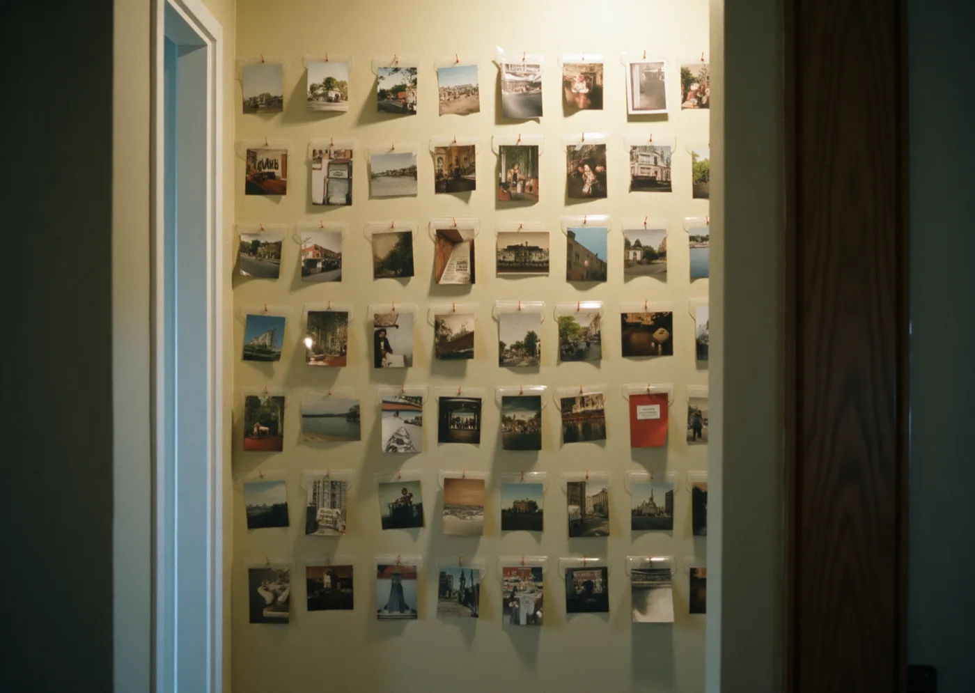
Why the box of menus is the whole idea You wrote: 'I also have a box of restaurant menus I have been keeping since I was nineteen… I don't know if that is relevant, I just like them.' It is relevant, though not quite for the reason it sounds. What you have been collecting is not fine printing — it is the everyday paper of places that feed people: printed that morning, thrown out that night, kept by one person entirely by accident. This world puts your own table into that box for the first time.
Two colours and the paper, kept literally You asked for two colours and the paper, and asked us not to add a third to be safe. This world prints in one ink only. The orange is not a second pass, it is a sheet you buy — so the loud colour of the pot arrives at full strength on the pieces that carry it, and everything else is navy on cream with nothing added. The names written in on the night are in Ruben's own marker, which is already one of the two.
- Whether the orange stock is on the shelf in October. The second colour is a sheet rather than an ink, which is elegant until A4 orange is out. Your files are due on 16 October and the dinner is 8 November, so there are three weeks of slack and no more. When the paper is missing this system does not go quieter, it goes monochrome — so both stocks have to be bought and run through your own printer before the design commits to them, and a domestic feed tray is unforgiving much above 170gsm.
- Whether a borrowed format can carry a private joke. A docket, a notice and a numbered tag are legible to a stranger precisely because they belong to every tasca in Lisbon before they belong to your flat. Nothing about the format is yours; only the words are. That is testable before anything is committed — print one card with your own wording on it and hand it to somebody who has been to three of the ninety-nine.
- Whether printing it like an institution reads as deadpan or as cold. You wrote that if it looks like it has grown up you will genuinely cry. The joke here is that twenty-six friends in a flat are treated with the exact seriousness of a place that has fed people for eight years — funny by understatement, and dependent on the reader hearing the understatement. Somebody who doesn't hear it reads a form.
- Whether the invitation and the menu card are the same object twice. This world answers both pieces with a printed listing of the evening, and they are the two things people handle most. There is a real answer available — different stock, different size, different job, the menu listing what is on the table while the invitation lists the night — but nobody has chosen between them yet, and it should be chosen before this direction is, not after.