The Word Itself
The invitation is one word at architectural scale: the date ninety millimetres tall, knocked white out of a flood of colour, with nothing pictured anywhere. It answers the third thing you named — Brazilian modernism and the concrete poets — where the word is not a label stuck onto a picture, the word is the picture.
- the word is the picture
- one idea per surface
- colour is ground, not ornament
- one field left empty
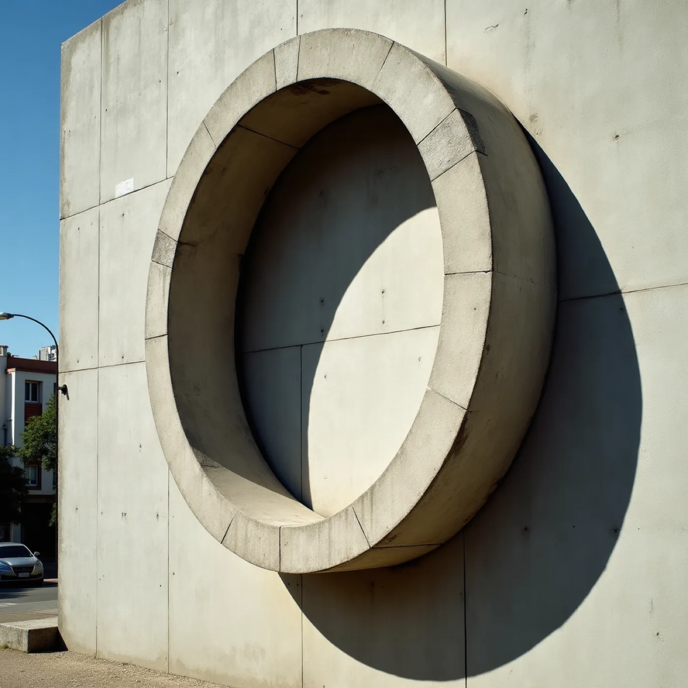
Proof that a letter can be architecture — cropped this close the word stops being read and starts being a shape with a shadow of its own, and that is the size everything in this world is set at.
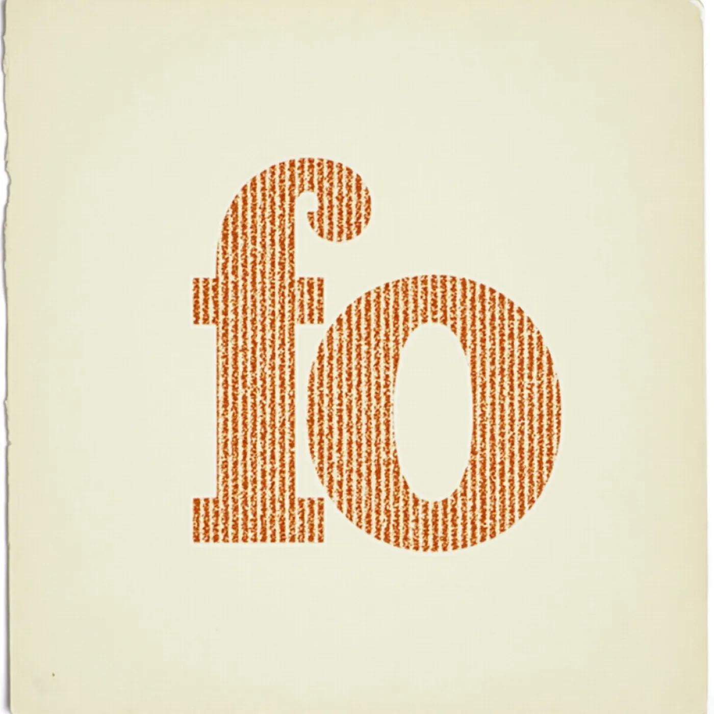
The tradition itself, on paper. Letterforms treated as shapes with weight and spacing rather than as a label for something else — which is the permission this direction runs on: a page can be entirely type and still be a picture.
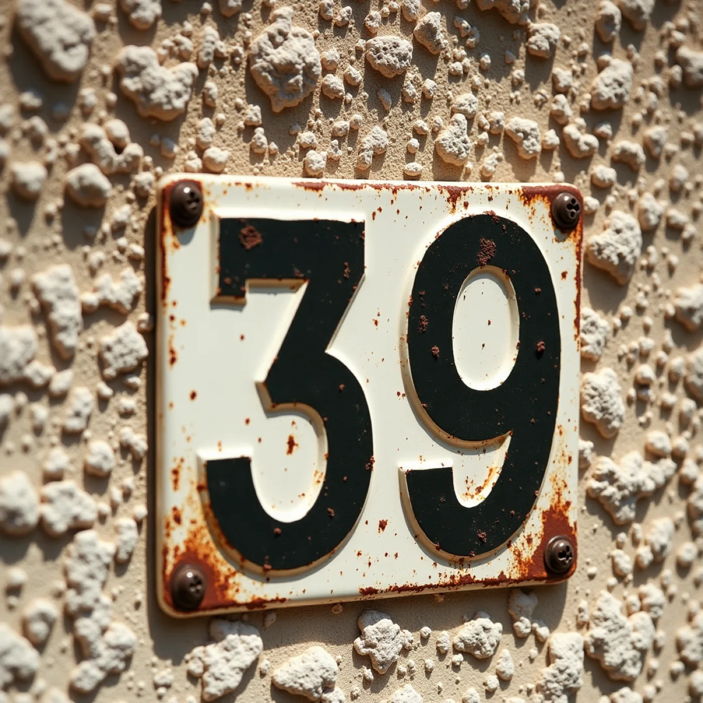
Figures are the hardest part of this world, so the face gets chosen on its 4 and its 7 before anything else — a date set ninety millimetres tall and a field ruled for results both stand or fall on numerals that survive weather and distance.
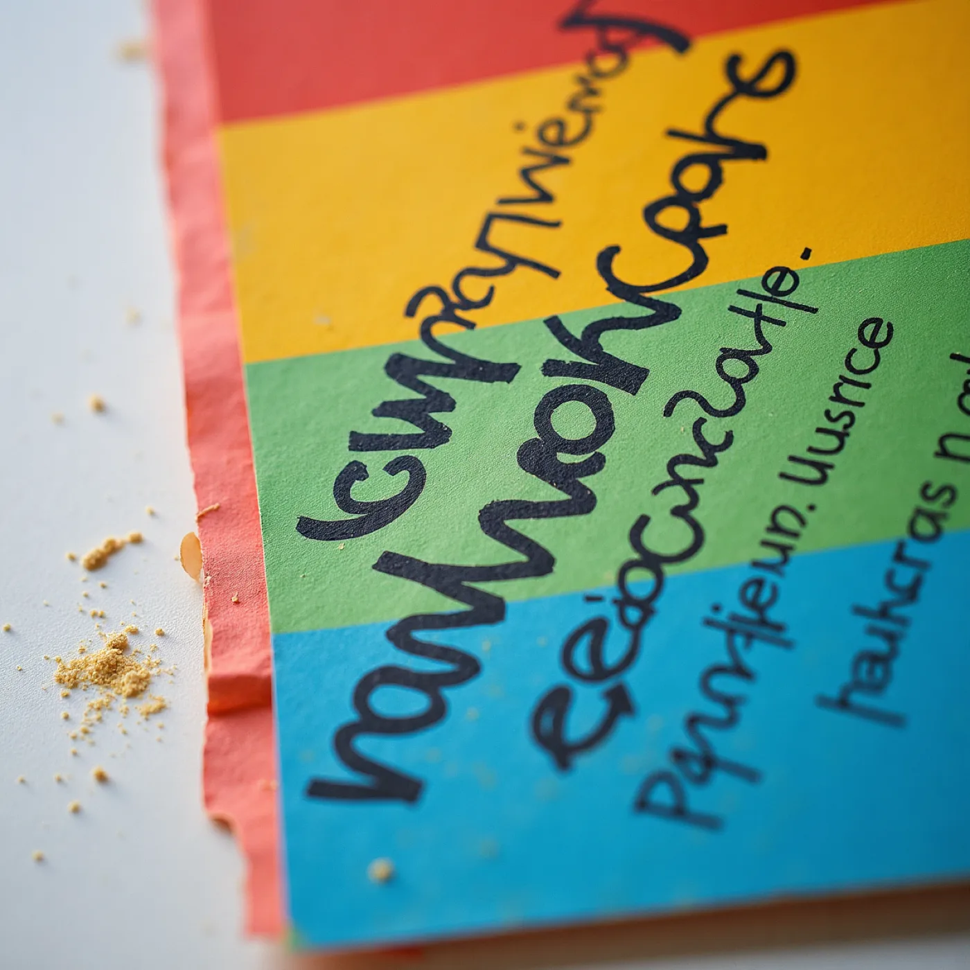
The argument for leaving one field printed empty — handwriting has to sit on top of flat ink without beading or skipping, which is a production question rather than a sentimental one, and it is why nothing in this suite is coated, varnished or foiled.
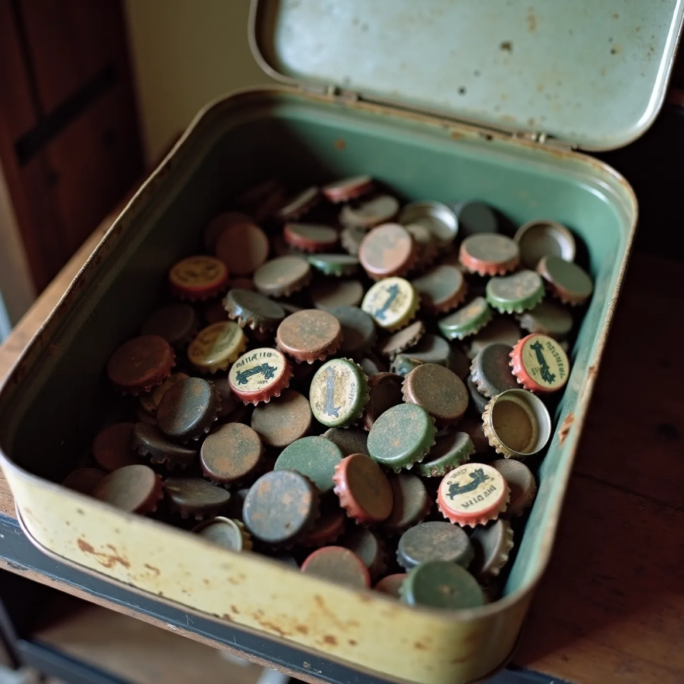
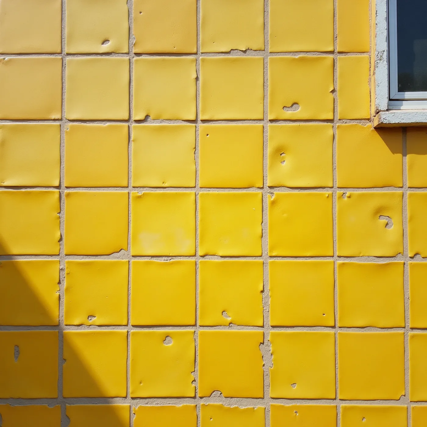
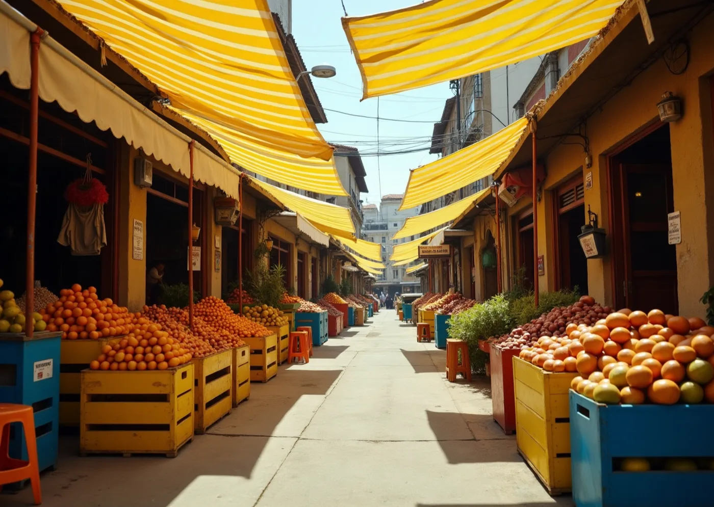
Rafael's grandfather kept one of these, and it is the whole idea in a tin — an object that records years without anybody having designed it to. It is also why the yellow here is a cap faded in a shed rather than a screen primary.
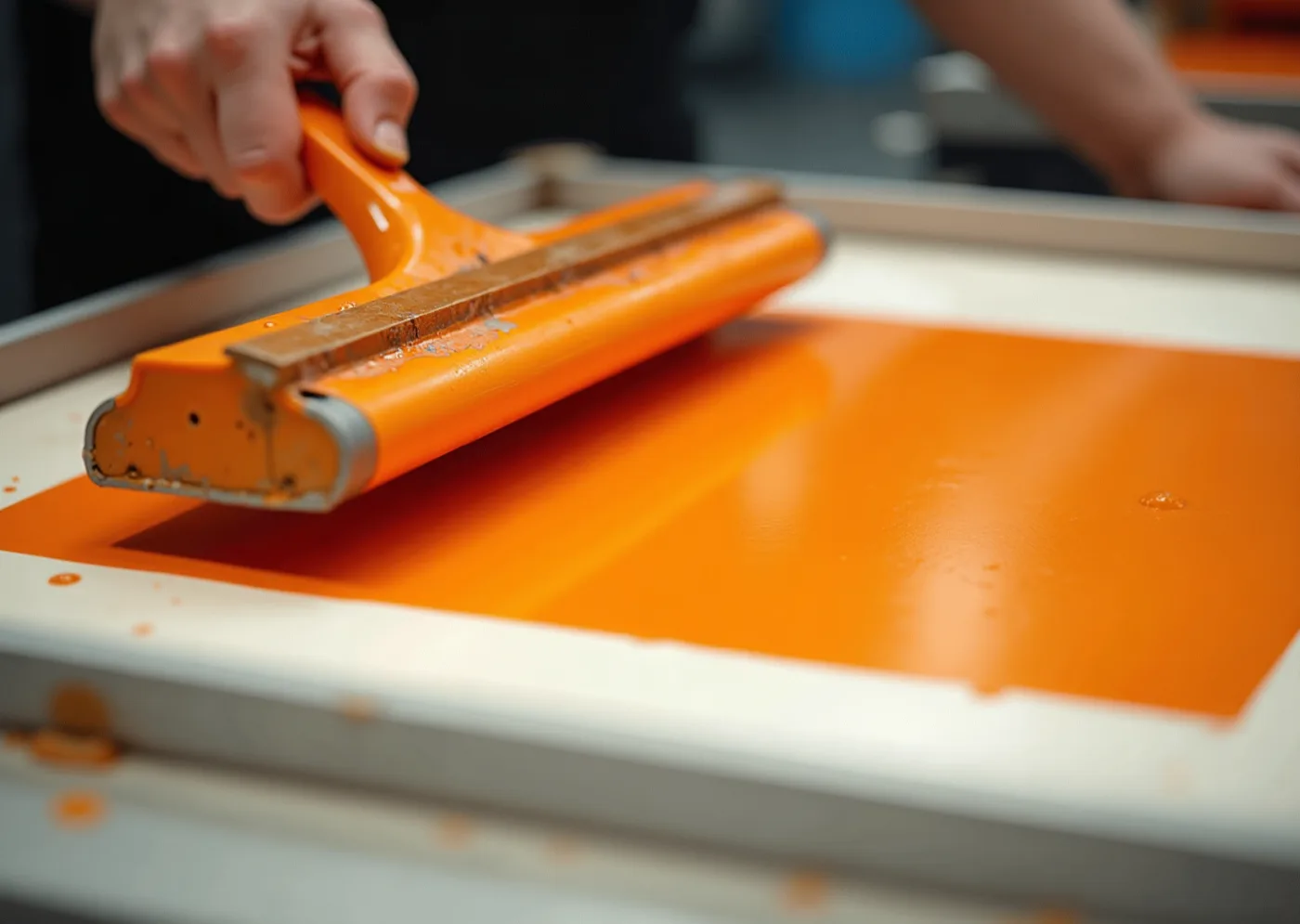
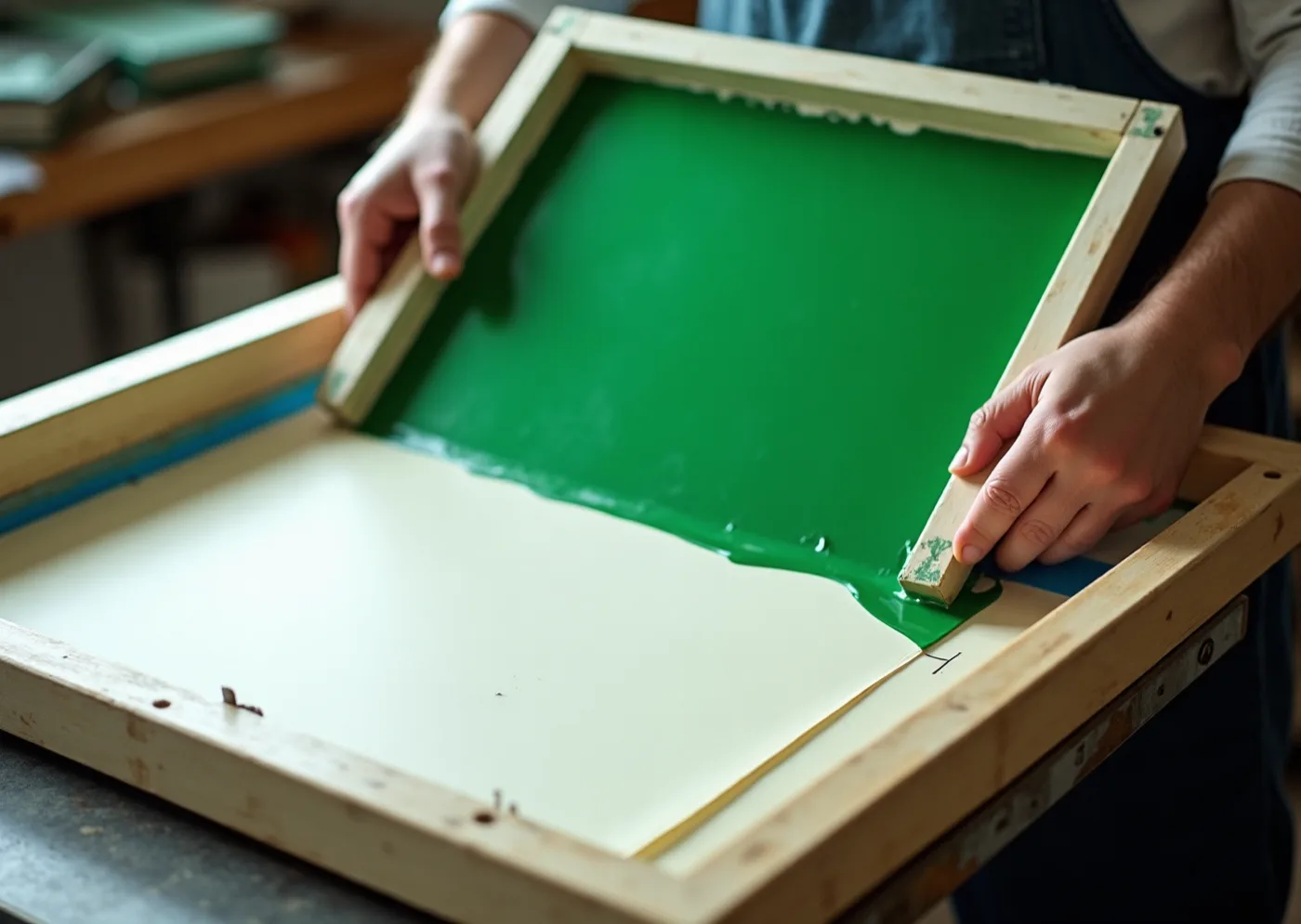
Opaque ink laid thick, at the size it prints. This is the difference between a colour that sits on the sheet and one soaked into it — and it is why a ground can be solid enough to hold a knocked-out letter at arm’s length or across a lawn.
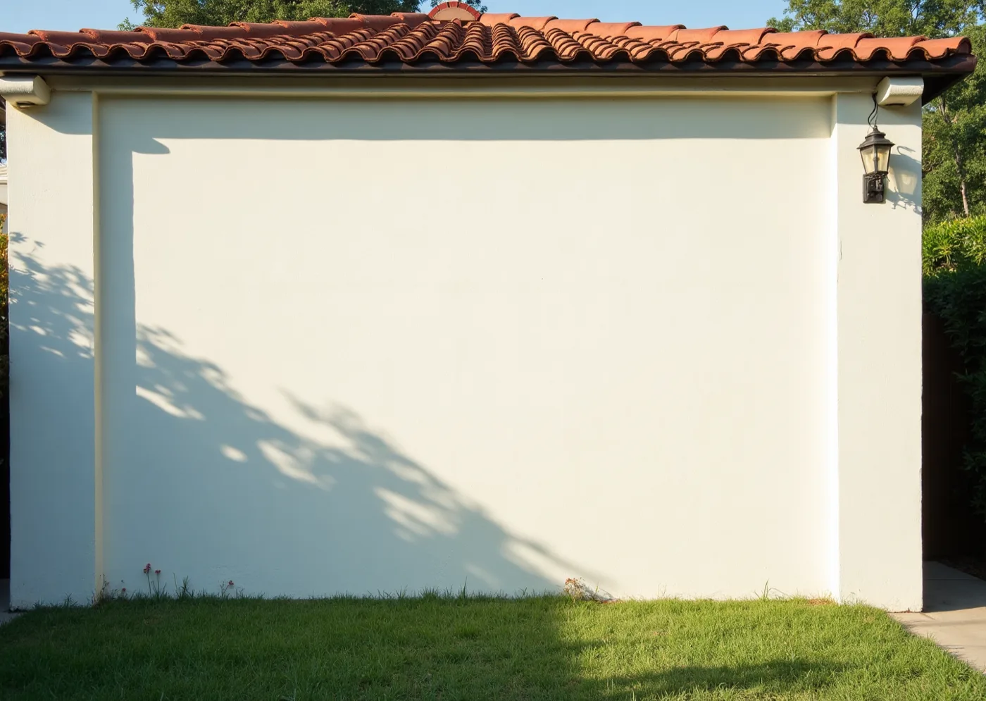
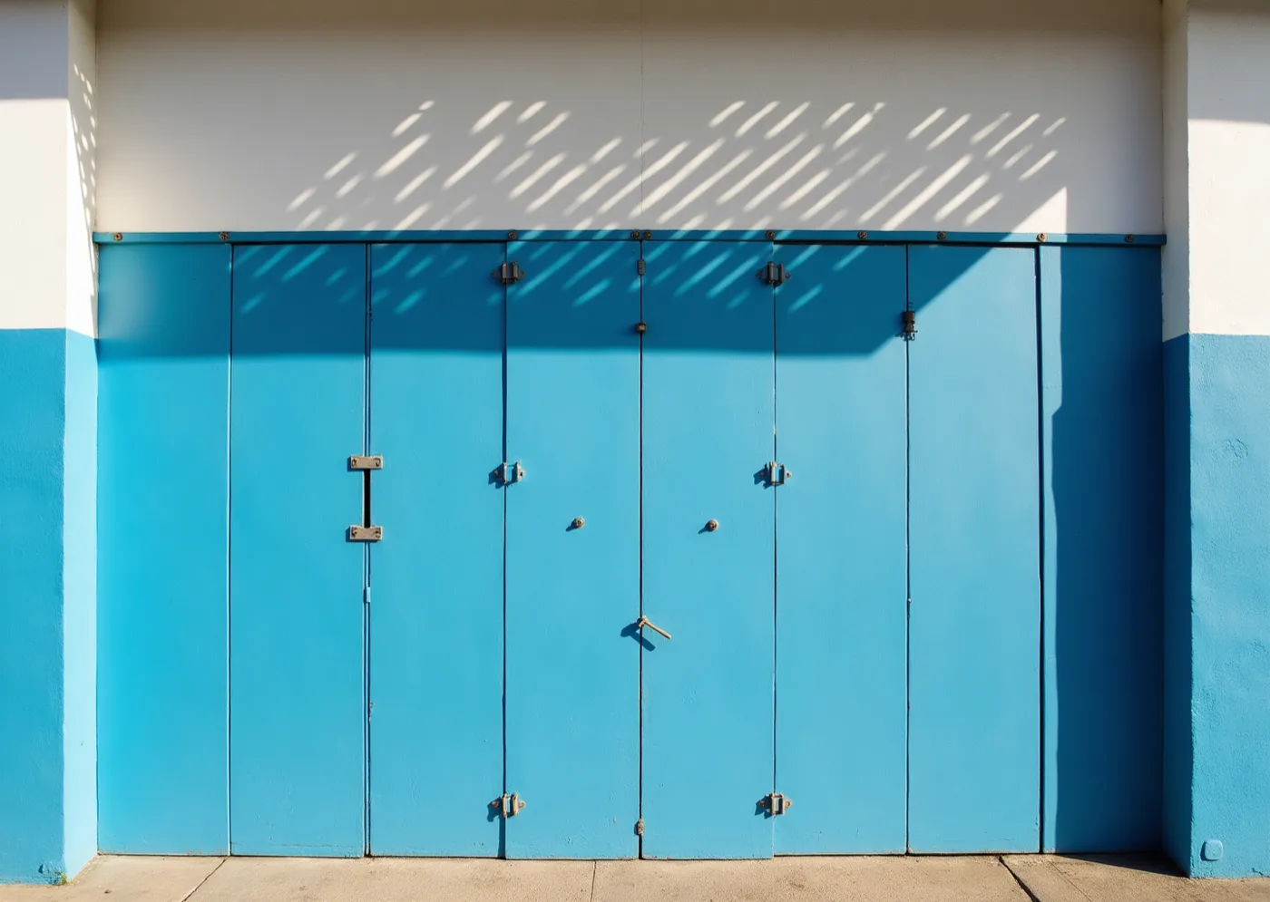
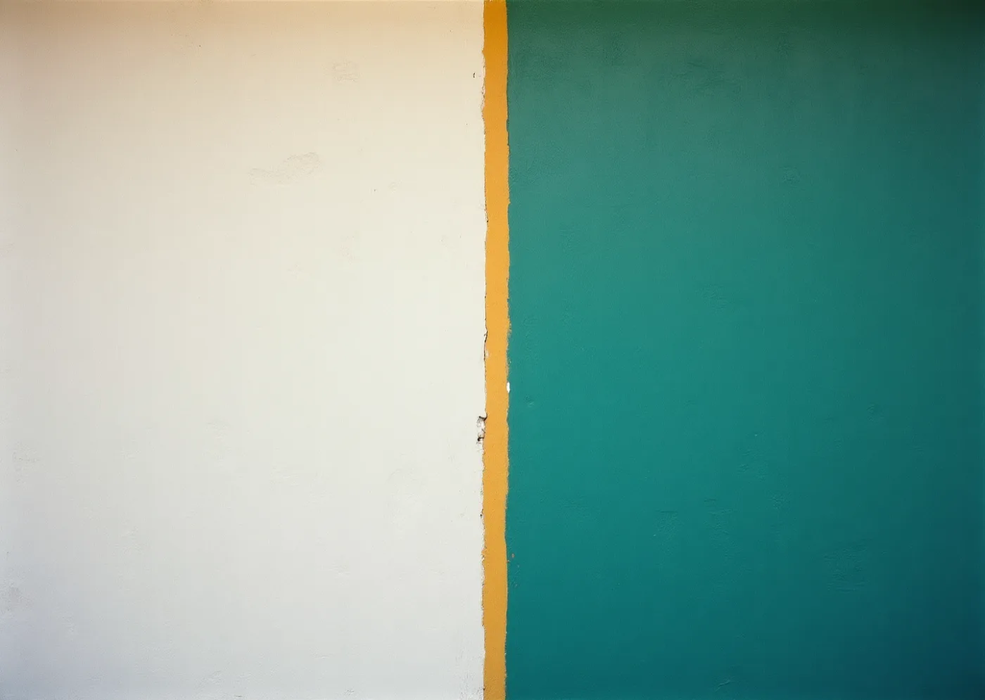
This is the wall the match is thrown onto at five, and until then it is the one flat white plane in the garden — everything printed has to hold its own beside a lit screen at dusk, which is the argument for grounds of solid colour rather than white cards with colour on them.
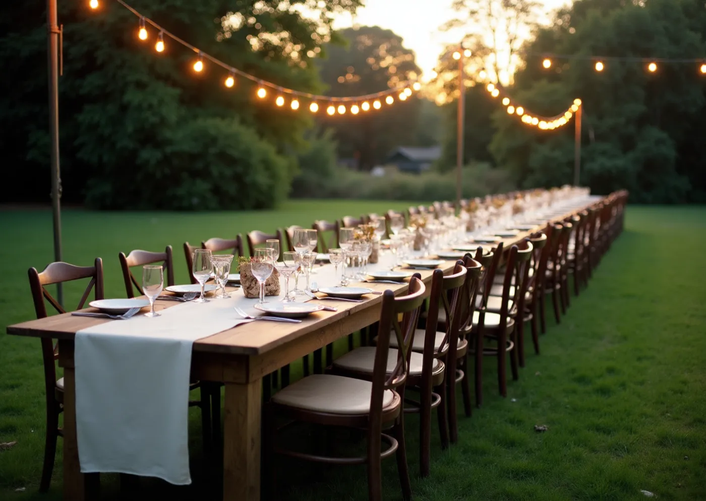
The acceptance test, and it comes before the desk test — a city name has to be readable from the far end of the table by somebody standing up and not stopping, which is the reason one word is given a whole surface.
Type specimen
display — Hanken Grotesk at its heaviest, caps, tracked in tight, set at the size where it stops behaving as writing
figures — Hanken Grotesk tabular lining, judged by printing a 4 and a 7 at final size and reading them outdoors, not off a specimen sheet
text — the same family, small, doing nothing but serving
One family throughout, because a second voice would argue with a word already ninety millimetres tall, and because the face that carries a date across a garden has to be the same one that sets a place card or the two stop being one object.
Materials & production
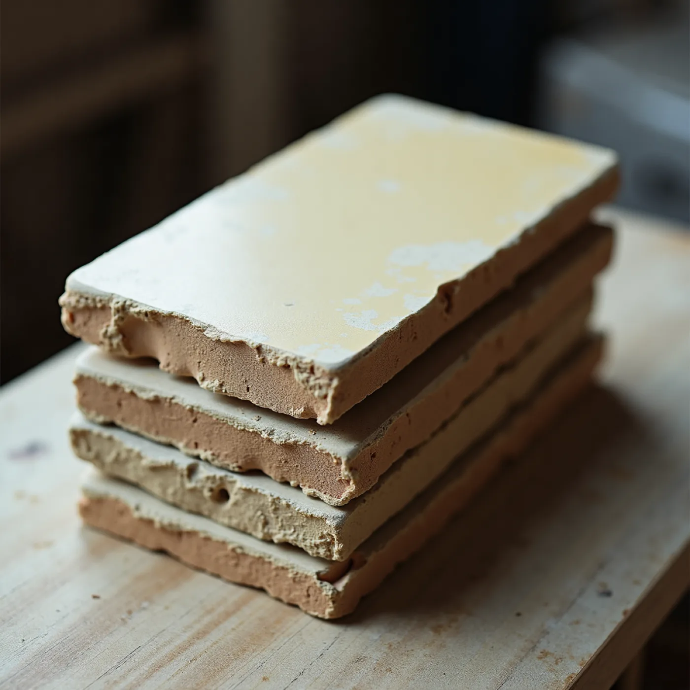
The same rigid uncoated board as any premium piece Evorrah prints — roughly 500–650gsm, bright white through the sheet so a cut edge is white and a knocked-out letter is genuinely the board. Screen print, two or three opaque inks on any one piece and frequently one on a flood: ink laid thick is what makes a 90mm letter look painted onto a surface rather than printed onto a card, and it is the whole difference between this world and a large digital print of the same layout. The one piece carrying the empty field is proofed with a pen before it is proofed with ink — the printed ground has to take ballpoint and marker without beading or skipping, which rules out coating, varnish and foil across the suite and is the reason the finish is bare ink on bare board. The outdoor pieces go to a rigid outdoor substrate colour-matched against the paper pieces at proof rather than assumed to match. The painted edge the client mentioned belongs here and is the one embellishment this world will take: a colour edge on a white board reads as a fourth plane on a piece that has only ever had three, and it costs almost nothing.
A wide rigid board flooded in one colour, the date knocked white out of it at ninety millimetres and read across a room before it is read in the hand. Your two names sit small at the foot in the same family; the back is a second flat field carrying gates at four, kick-off at five, and the address. A painted edge in the blue is the only embellishment this world takes, and the envelope liner is the third colour, so the suite has shown all three before the card is out.
Nine pieces where the ground colour changes rather than the layout: the menu yellow, the bar card blue, the eight table cards green because they stand on the grass. One idea per surface — a place card is a name, a table card is a city, and RIO DE JANEIRO fills its card edge to edge.
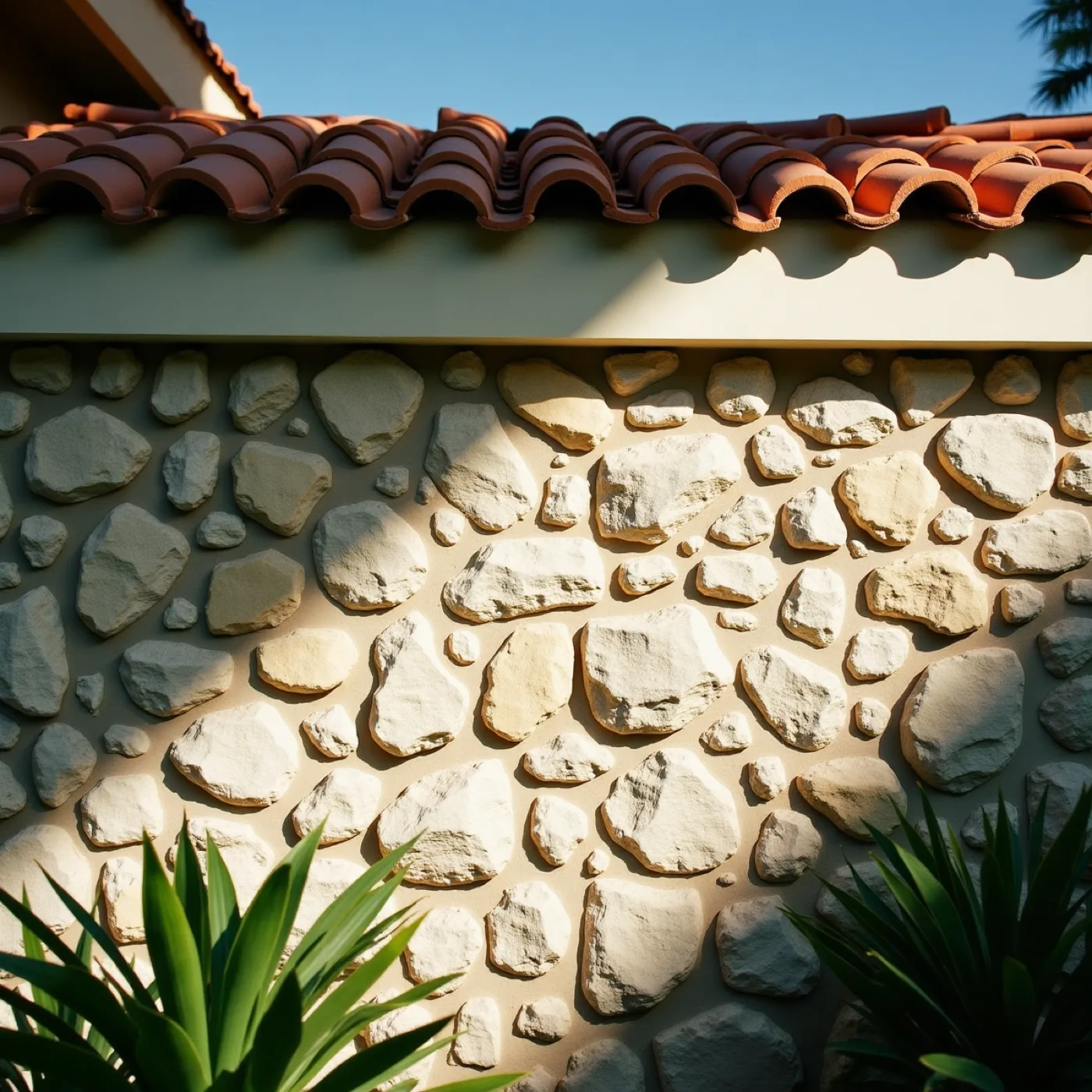
One word on a board leant against the coral-rock wall at the gate, read from the pavement before anything else. And the large panel you asked for: a field printed empty and ruled in these same inks, hung on the garden wall and filled in by hand match by match, which answers his grandfather's 1970 chart in Niterói instead of copying it.
The RSVP page is one word and one field, the date as large as the screen allows. The share image is the date alone at 1:1, legible at thumbnail size because it is four figures rather than a picture, and it survives being forwarded to sixty-four phones.
Read one word from the pavement before you reach the gate → find your table by a city name you can see standing up → and on the way out, the panel on the garden wall with somebody else's handwriting already on it.
The third reference, taken at its word You named three things: the tournament posters of the sixties, the azulejo panels, and Brazilian modernism — Magalhães, Wollner, the concrete poets. This direction takes the third, where the word is not a caption on a picture but the picture itself. That has a practical consequence as well as a romantic one: with nothing pictured anywhere, there is nothing in the system that can drift toward merchandise.
The colour we never print The ruled field goes up empty and is filled in on the day, in whatever pen is on the table, so the red on your garden wall in July was put there by somebody at the party rather than by us. It is deliberately not one of the four inks, and it is the reason the printed ground has to be bare ink on bare board with nothing coated over it.
- Whether our colour survives a garden wearing the same colour. You asked everyone to come in their colours, so by five the garden is full of the same yellow, blue and green we are printing. A flooded ground works because it is the loudest thing in the frame; on a table of people already wearing it, it may simply join in. That gets settled by proofing a card outdoors against a shirt, not by looking at a board.
- Whether one idea per surface survives the menu. The rule holds for a name, a city, a date. Then the menu arrives with thirteen dishes and three dietary marks that have to be clear enough that nobody has to ask, and either the rule bends on the fourth piece or the menu becomes three cards.
- Whether the empty field survives June outdoors. It has to take a ballpoint over screen ink, on a wall, in Miami damp, and still be worth keeping afterwards. We have not proofed ink over ink in those conditions, and it is the one piece in the suite we cannot reprint on the day.
- Whether a mark cut from a letter stays the family's. Building it out of the suite's own B is what lets anybody re-strike it in 2031 and 2035 from type alone, which is what Rafael asked for. The risk is that it then belongs to the typeface: change the face in eight years and the mark changes with it. Drawing it once and keeping it as artwork closes that off, and gives up the easy re-striking.