Margot & Rafael Bellamy · 17 October 2026

The October Tasting

Six wines from the Douro, small plates to match, and long conversation
Two worlds · one choice

Both worlds are built from the same two inks — a paper cream and one brick red — because you asked for one colour and meant it. What separates them is not colour but who does the talking: in the first, a hand draws the table; in the second, the words are set like a label and nothing is drawn at all.

World One
One Red Pen

Somebody sat down with one red ballpoint and drew everything that would be on the table that night — the bottle with the ribbon still on it, the good glasses, the cheese, the bread, the bowl of almonds — round the edge of the paper, and wrote the invitation in the space left in the middle. The back of every card is the painted floor of a kitchen in Régua.
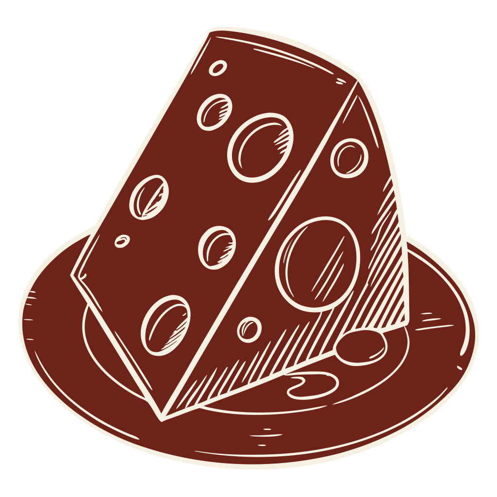
drawn wedge of cheese
drawn ribbon bow
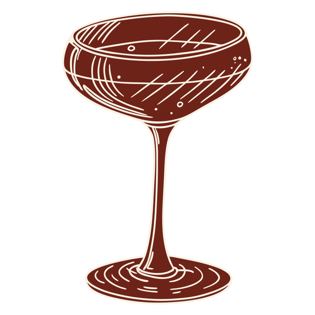
drawn wine glass
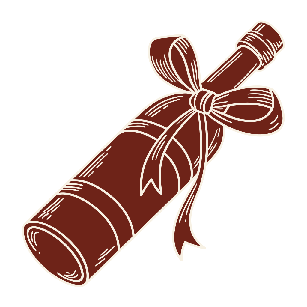
drawn bottle with a bow
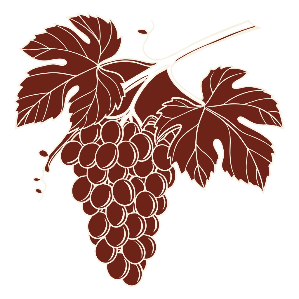
drawn bunch of grapes
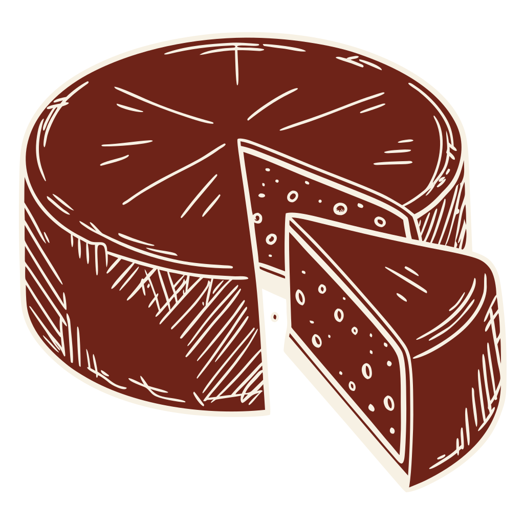
drawn wheel of cheese
wine tasting
The worldEverything on the table, drawn in one pen, with the words in the clear middle. Nothing here is an ornament — every object is something that will actually be in the room on the night.
The floor in low light
#6E2318
Placemat cream
#F7F1E4
Cream, knocked back
#E3D2B6
The colourTwo colours, and the third is not a third colour — it is the same pen pressed harder, used only where type gets very small. The red reads 5.7 : 1 against the cream, which is what lets it be the background as easily as the ink.
The colour, in useThe kitchen floor in Régua: red and cream squares painted by hand, so no two are the same size and the paint is thin in places. This is the back of the invitation, and the back of everything else.
The letteringTwo hands and nothing else, as you asked. A bouncy sloped script for the name of the evening — brush-drawn, never calligraphy — and one quiet bistro italic underneath it doing all the work.
The materialUncoated natural, one risograph drum. The edge of the ink breaks slightly and the paper tooth shows through — the cheapest process that gives exactly the look of a pen on a paper mat, and the reason a second colour would cost nothing and still be wrong.
Light & energyTwo table lamps in a room that is slightly too small, at half past six in October. Warm, low, close. Nothing on the printed pieces is bright, because nothing in the room will be.
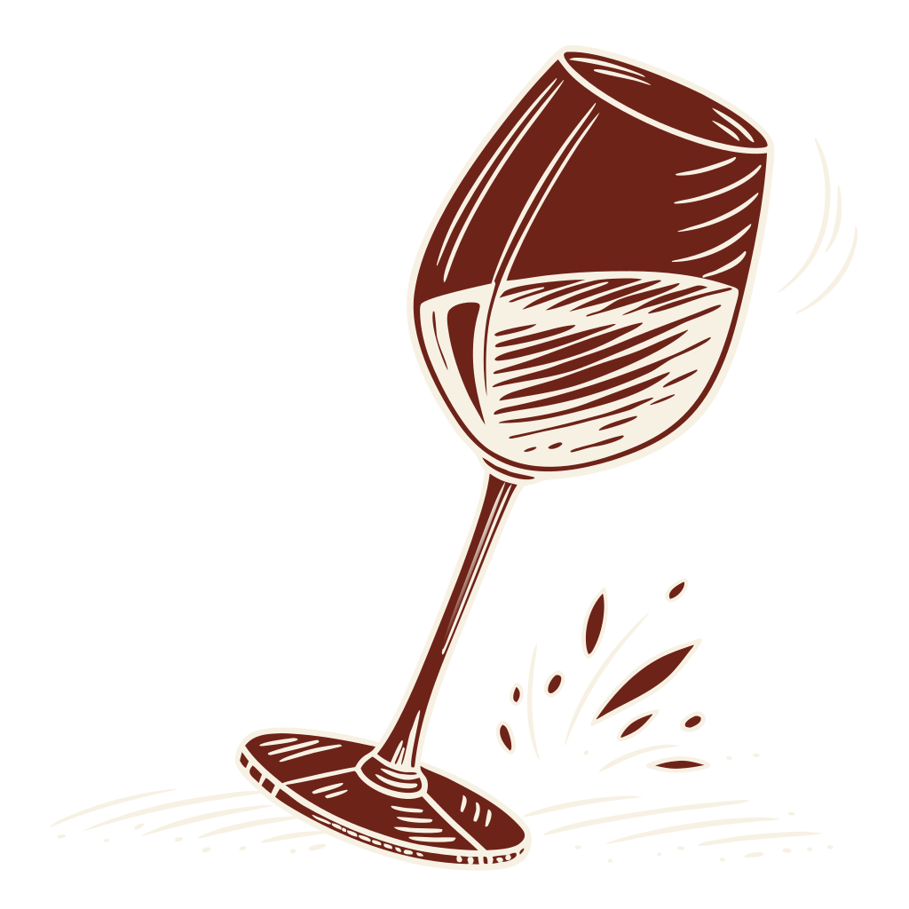
The drawn vocabularyThirteen objects, and that is the whole alphabet — no piece in the suite may introduce a fourteenth. Twelve ring the invitation; the rest lead the smaller pieces.

Your nine pieces, in this world

  1. Invitation — twelve objects round the edge, your words in the clear middle, the painted floor on the back.
  2. Save the Date — the bottle with the ribbon still on it, drawn large, and two small ones at the foot.
  3. Menu Card — the small plates, listed in the same hand, with the letters for vegetarian and gluten-free set plainly beside them.
  4. Tasting Flight Card — the six wines in pouring order, numbered, each with Rafael's own line about what it tastes like.
  5. Place Card — a name in the italic, one small drawn mark, the floor on the reverse.
  6. Table Number — one and two, in the script, at the size of the card.
  7. Welcome Signage — the ring opened out to A2, so the objects are nearly life-size at the door.
  8. Bottle Tag — hangs on the neck, punched and tied, so anyone can go back and find the one they liked.
  9. Thank You Card — the floor on the front, three lines on the back, nothing else.
Still open in this world
  • Whether thirteen objects is the right alphabet. It is fixed by law and no piece may invent a fourteenth. Nobody has yet checked that thirteen is enough for nine pieces, or that all thirteen are worth drawing.
  • Whether one riso drum can hold the painted floor. The floor is the back of everything and it is the heaviest coverage in the suite — which is exactly where a single drum streaks.
  • Whether “pressed harder” is a third colour after all. It is argued as the same pen rather than a new ink. On press it is a second tint, and a printer will quote it as one.
  • Whether the drawn hand can be kept out of calligraphy. Brush-drawn and never calligraphy is the instruction; that line is held by whoever is holding the brush, and it has to hold across every piece.
World Two
The Label

The invitation is a bottle label. Everything a label does — the estate line in small capitals, the name cut large, the year enormous, the fine print set tight and low — the card does with your evening instead. There is no drawing anywhere in this world. The character is entirely in how the words are cut and how deep they are pressed.

Label red
#A63A2B
Stock cream
#F7F1E4
Pressed harder
#7E2A1F
The colourThe same two inks, with their jobs swapped: here the red is usually the field and the cream is the type. Same brief, opposite instinct.
The October
Tasting
Bellamy · Hudson · Douro

Six wines poured in order, a small plate against each, and no one told what they are drinking until after they have drunk it.

Bodoni Moda · Archivo · rules, no ornament
The letteringA high-contrast didone doing the shouting and a plain grotesque doing the fine print — the two faces every wine label in the Douro already uses.
XVII
X
The materialThe same uncoated stock, a different machine: letterpress, struck hard enough that you can feel the date with your thumb. The whole luxury of this world is depth rather than drawing.
The graphic languageRules and bars, at four weights, and nothing else. They divide, they underline, they carry the eye down the card — they never decorate.
No illustration. No photograph. Nothing drawn, anywhere, on any piece.
ImageryStated rather than implied, because it is the whole thesis: this world refuses pictures. If it wins, the suite has no drawings in it at all.
Light & energyOne hard window rather than two soft lamps. Cooler, more upright, more like a tasting and less like a dinner — which is either exactly right for you or exactly wrong.

Your nine pieces, in this world

  1. Invitation — the front label; the reverse carries the back-label fine print.
  2. Save the Date — the date alone, struck at card size, nothing else on the sheet.
  3. Menu Card — the plates as a ruled list, weights doing what a drawing would have done.
  4. Tasting Flight Card — six numbered bands, each a label of its own.
  5. Place Card — a name in small capitals between two rules.
  6. Table Number — one enormous didone numeral, edge to edge.
  7. Welcome Signage — the label at A2, so the year is the size of a face.
  8. Bottle Tag — a real neck label, printed both sides.
  9. Thank You Card — two rules and four words.
Still open in this world
  • Whether both worlds can share one palette and still be a choice. These two use the same three values, and the only difference is which one is the field. That may be the sharpest possible comparison — or it may mean the client is not really being offered two worlds.
  • Whether a label with no drawing needs the floor at all. This world says there is no drawing anywhere, and the painted kitchen floor is the strongest thing either world owns. Leaving it out is a real loss nobody has argued for out loud.
  • Whether the enormous year is the right enormous thing. A label puts the vintage largest. This is a tasting, not a vintage, and the number that matters may be the six wines rather than the year.
  • Whether strict centring survives nine pieces. Fixed furniture and centred everything is what makes a label a label. It is also the least flexible grid there is, and the flight card has six entries and a line of tasting notes each.

Direction A — One Red Pen — is the world that was built. Every piece in the suite descends from it; The Label was not carried forward.

See the finished suite →